A strong brand, with no way to pass it on.
OnePointHealth runs six departments across allied health and community care, from offices in the Blue Mountains. Staff and patients already recognised its brand, and years of steady growth had given it a way of speaking that worked. What nobody had done was write it down. The internal marketing team applied the brand well on their own, but a new starter or a coordinator drafting a flyer had nothing to work from.
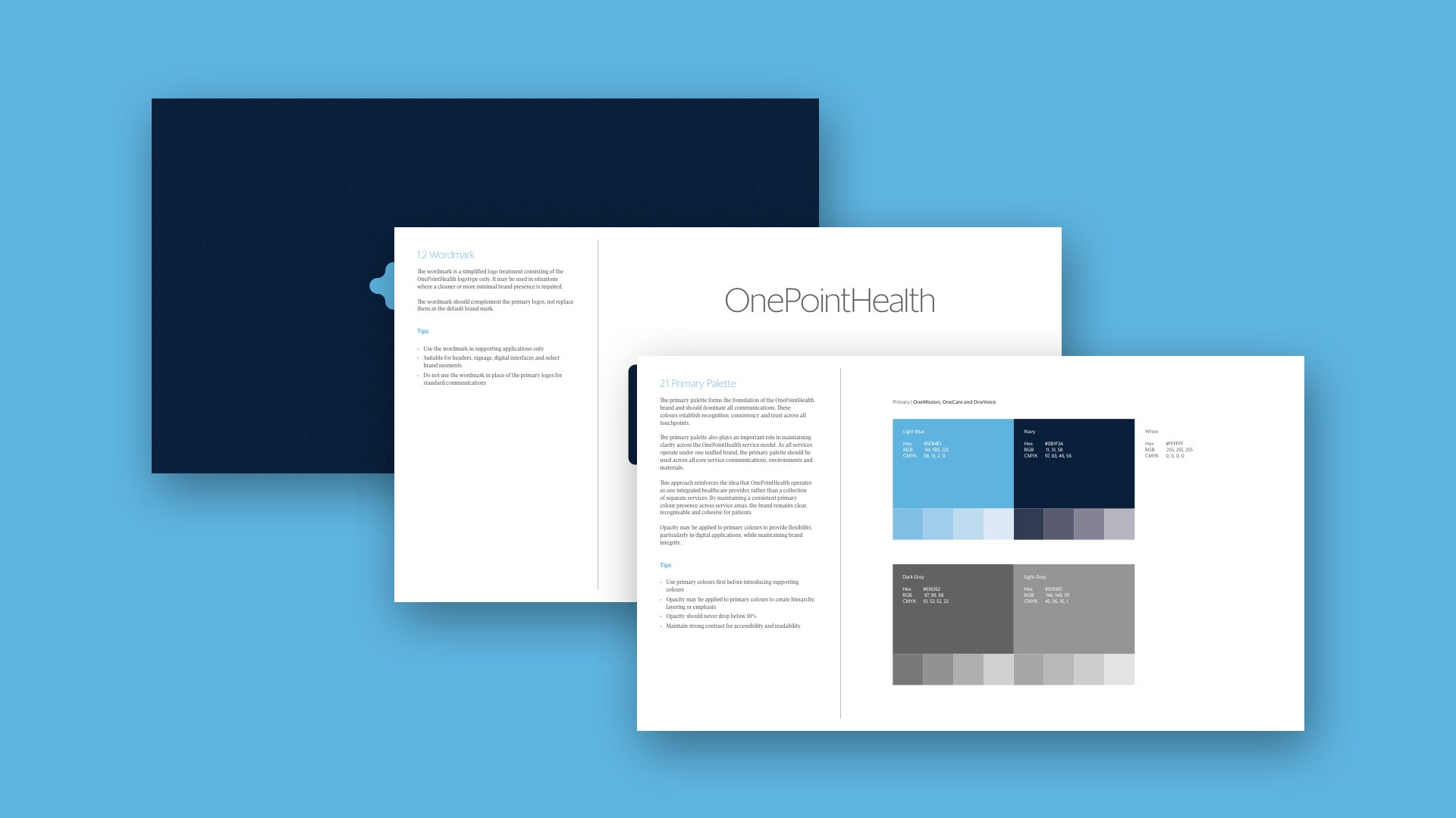
We audited the existing brand and language rather than starting over, then turned what we found into structure. The guidelines cover logo, colour, typography and photography direction. A language framework sets the tone and the messaging for each service area, so a physiotherapy flyer and a community care poster sound like the same organisation.
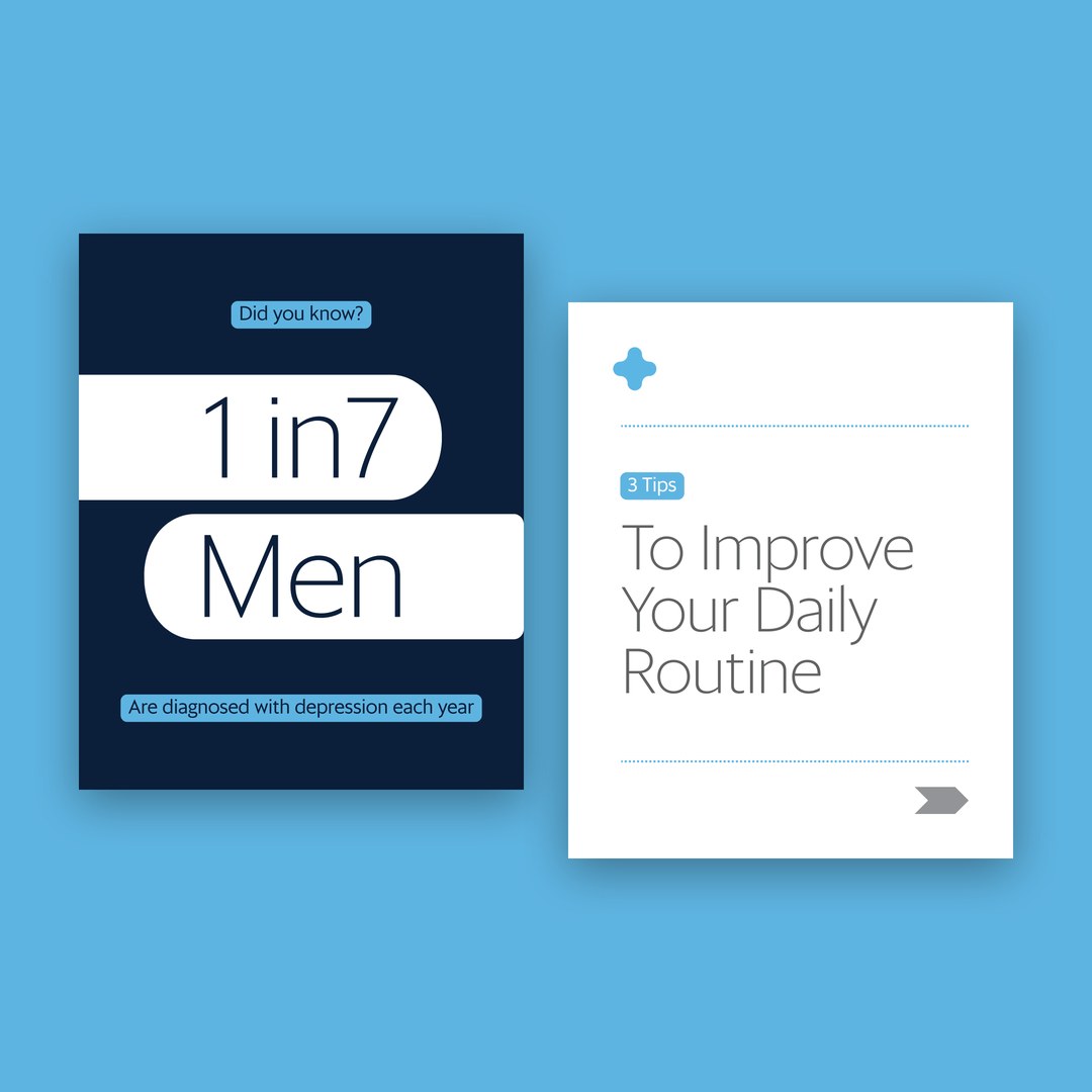
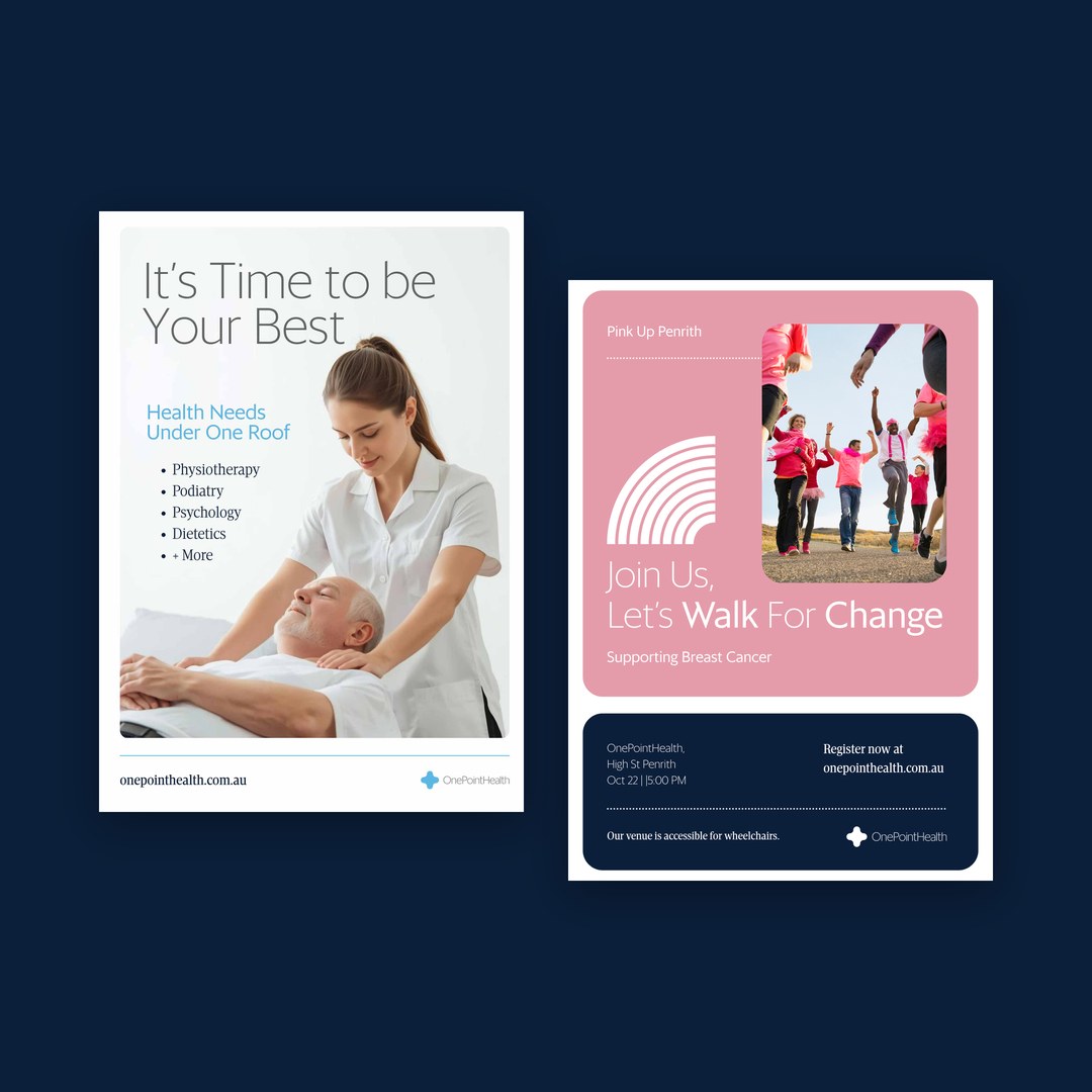
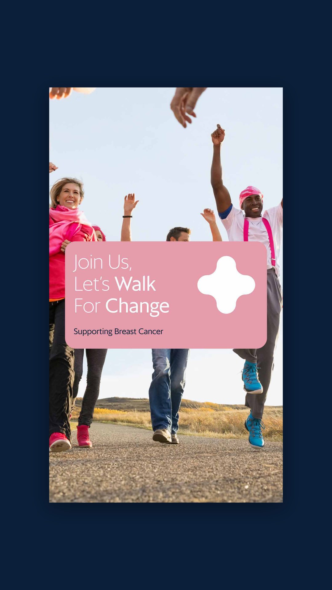
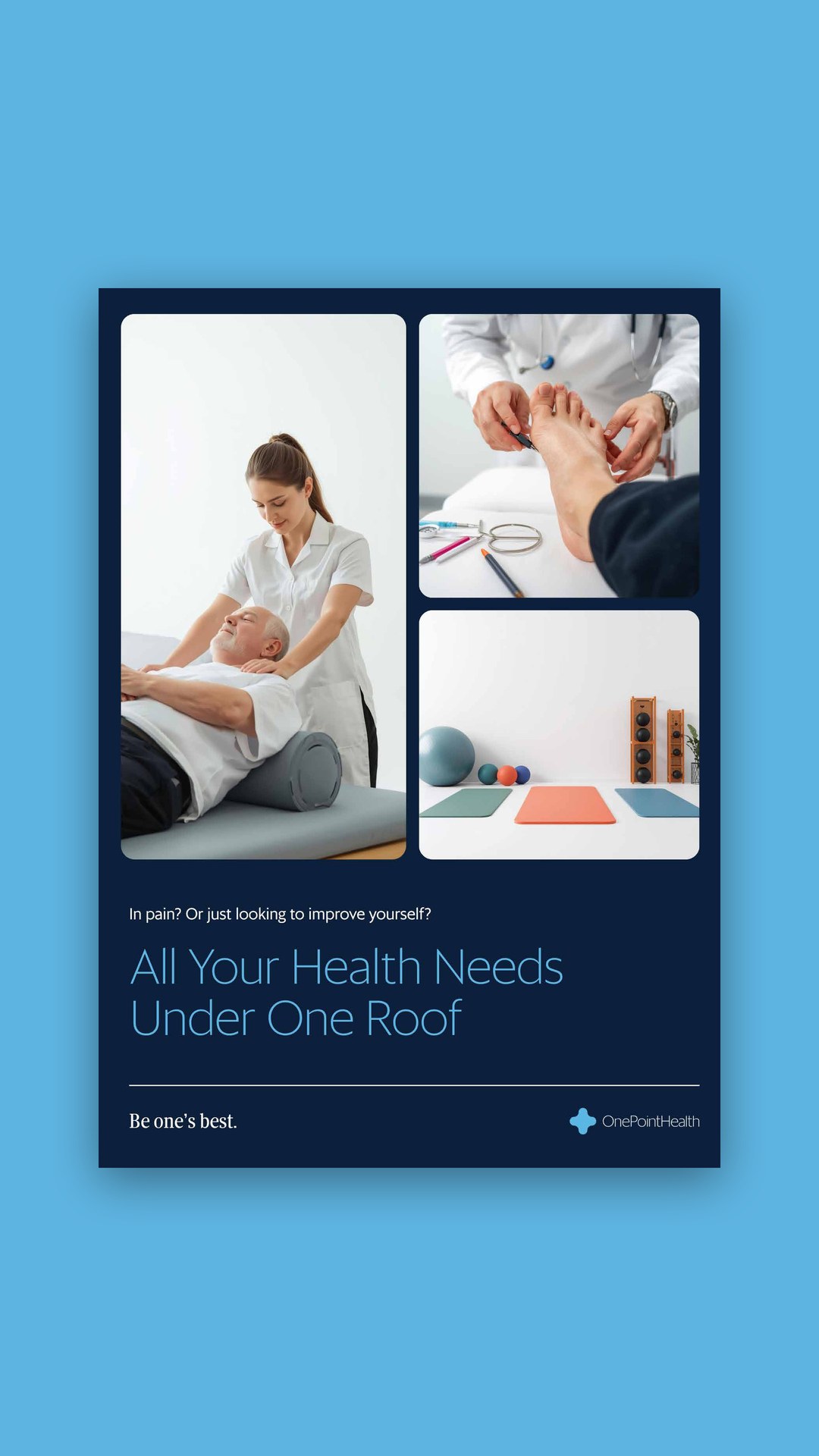
We also designed a set of proposed templates, covering event flyers, awareness posters, social cards and a service brochure. OnePointHealth’s own team took them, with the guidelines and the language framework, and built out the rest of their templates themselves.
The gallery shows the templates with sample campaigns, including a breast cancer fundraising walk, an evening on wellness and resilience and a men’s mental health night. Each one looks and sounds like OnePointHealth, whichever service it promotes.
New starters and coordinators now work from one reference, and OnePointHealth reads as one organisation in every department.