One parent brand, with room for sub-brands.
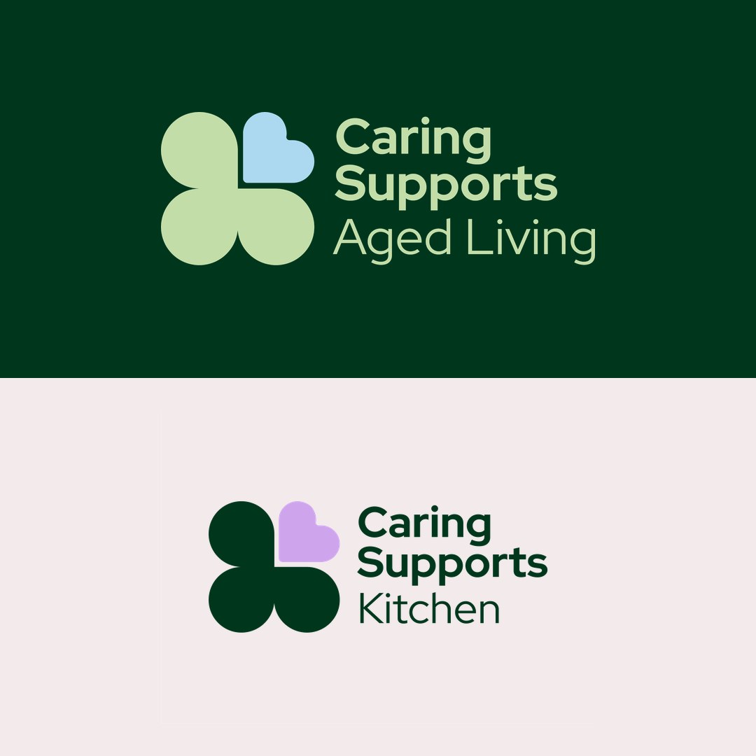
Caring Supports For You is a disability service with sub-brands of its own: Aged Living and Kitchen. Each needed to be recognised for what it offers, without looking like a separate organisation from the one behind it.
That puts a limit on how far the sub-brands can drift. Give each service its own logo and the parent loses its hold. Give them none and the services blur together. The identity had to sit between those two outcomes.
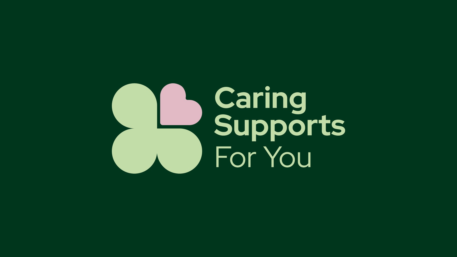
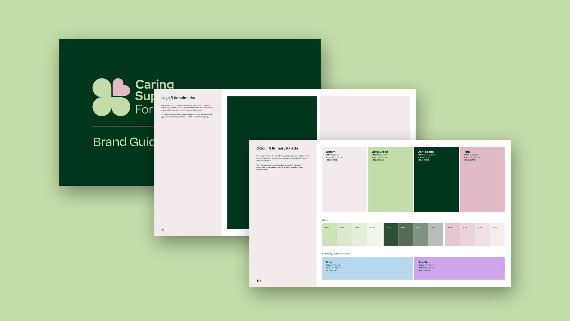
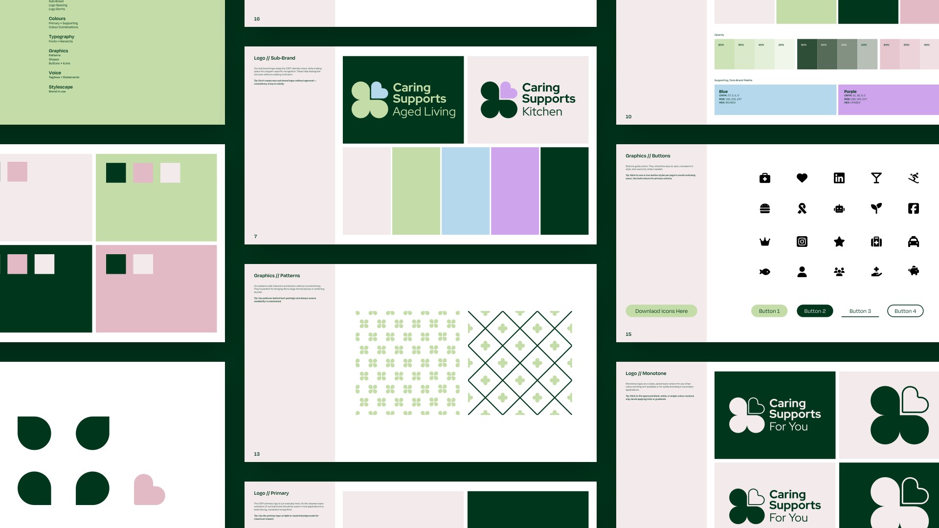
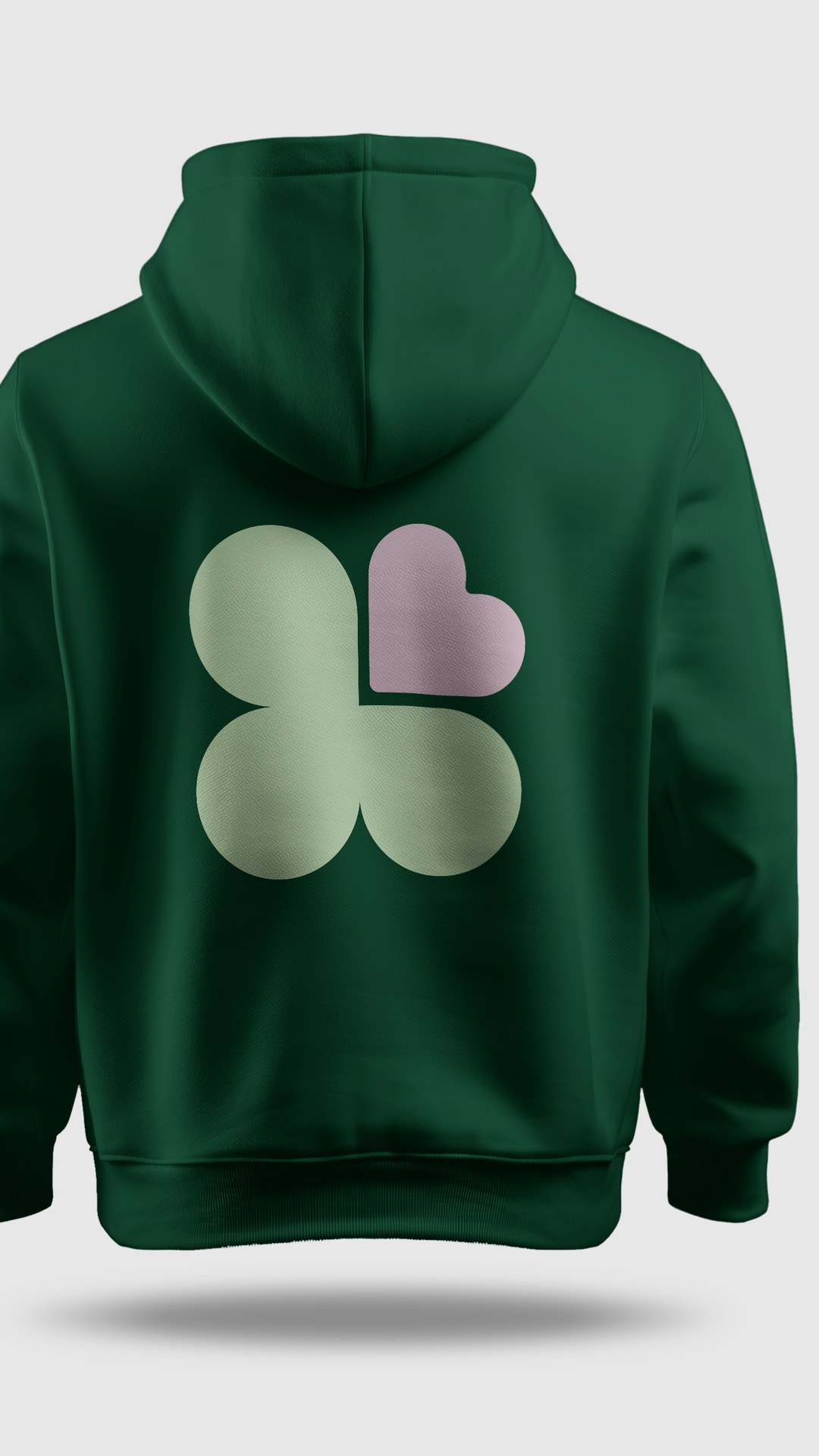
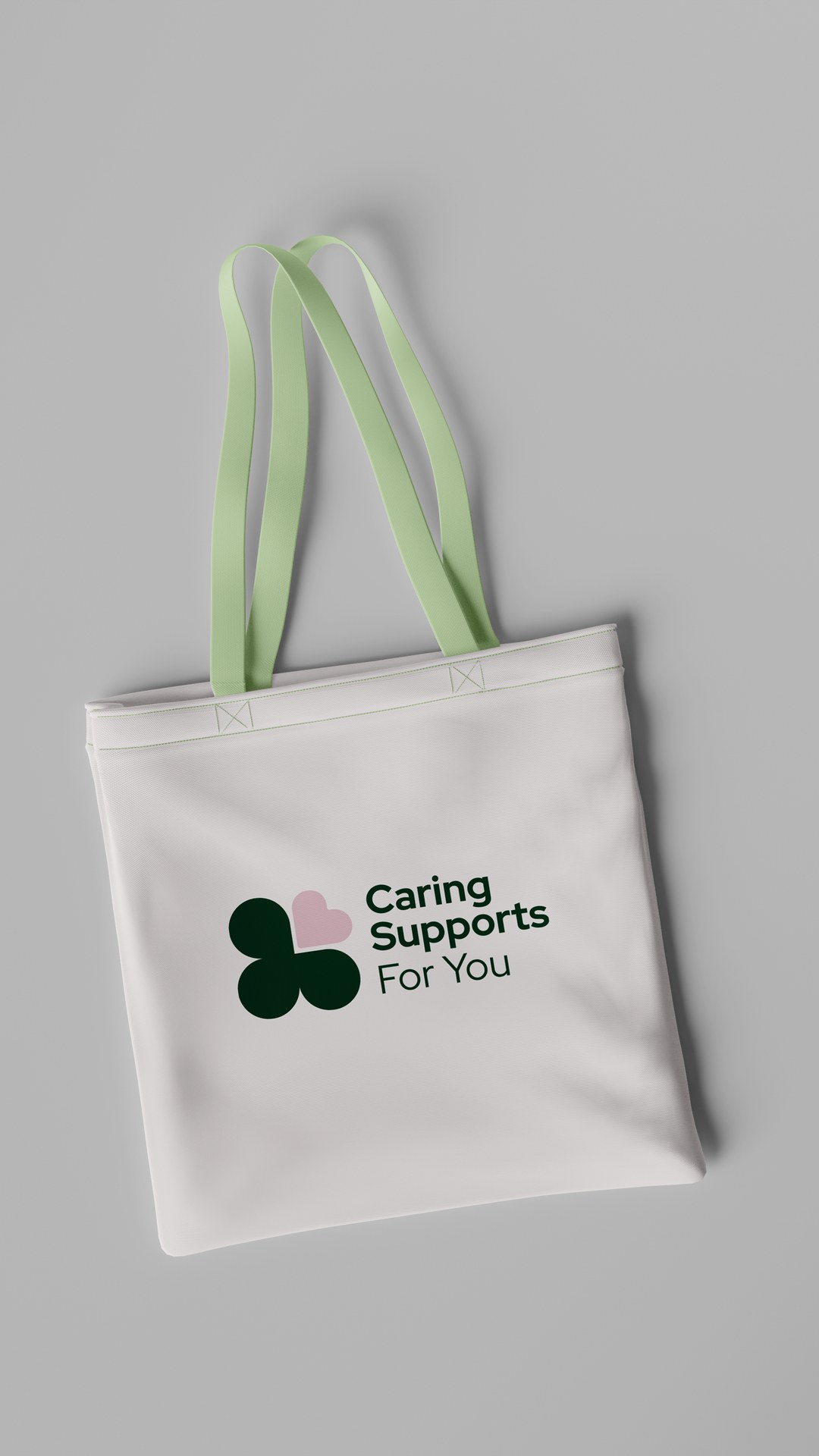
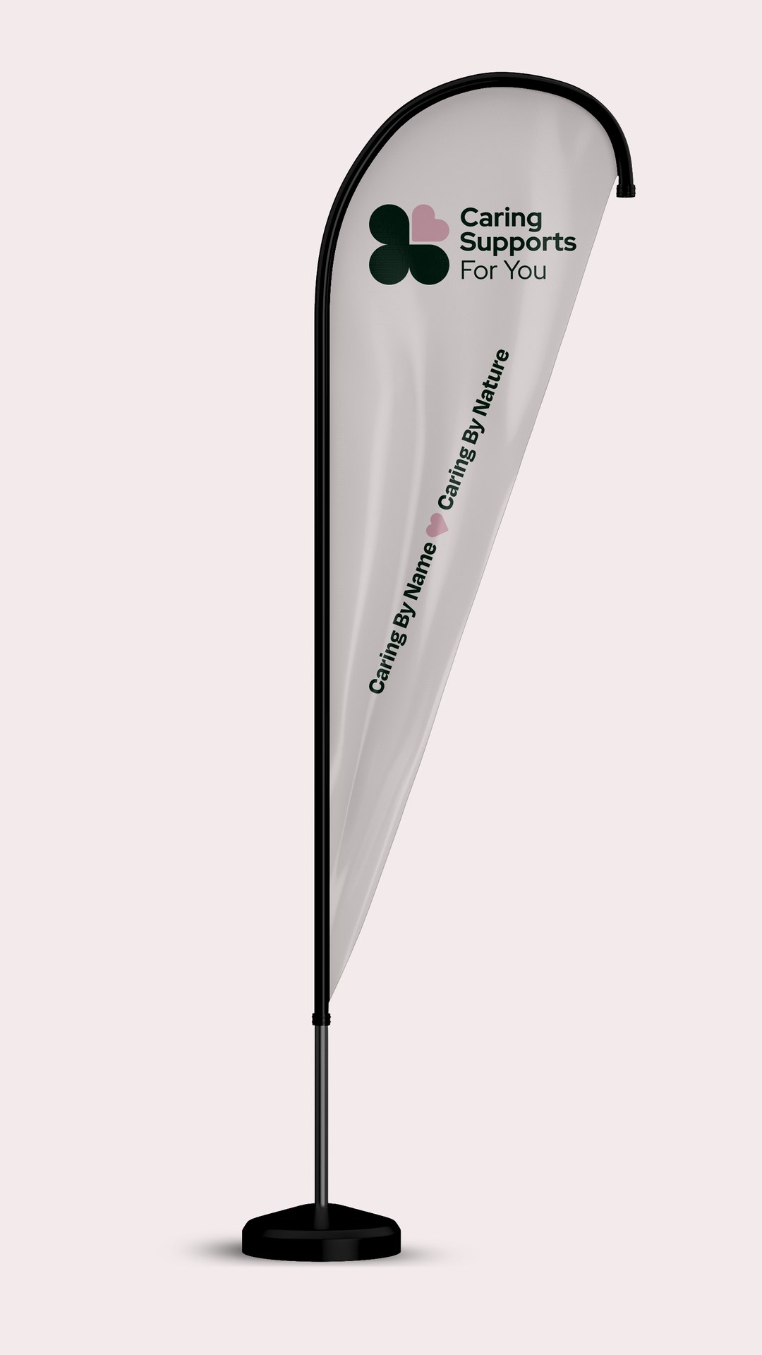
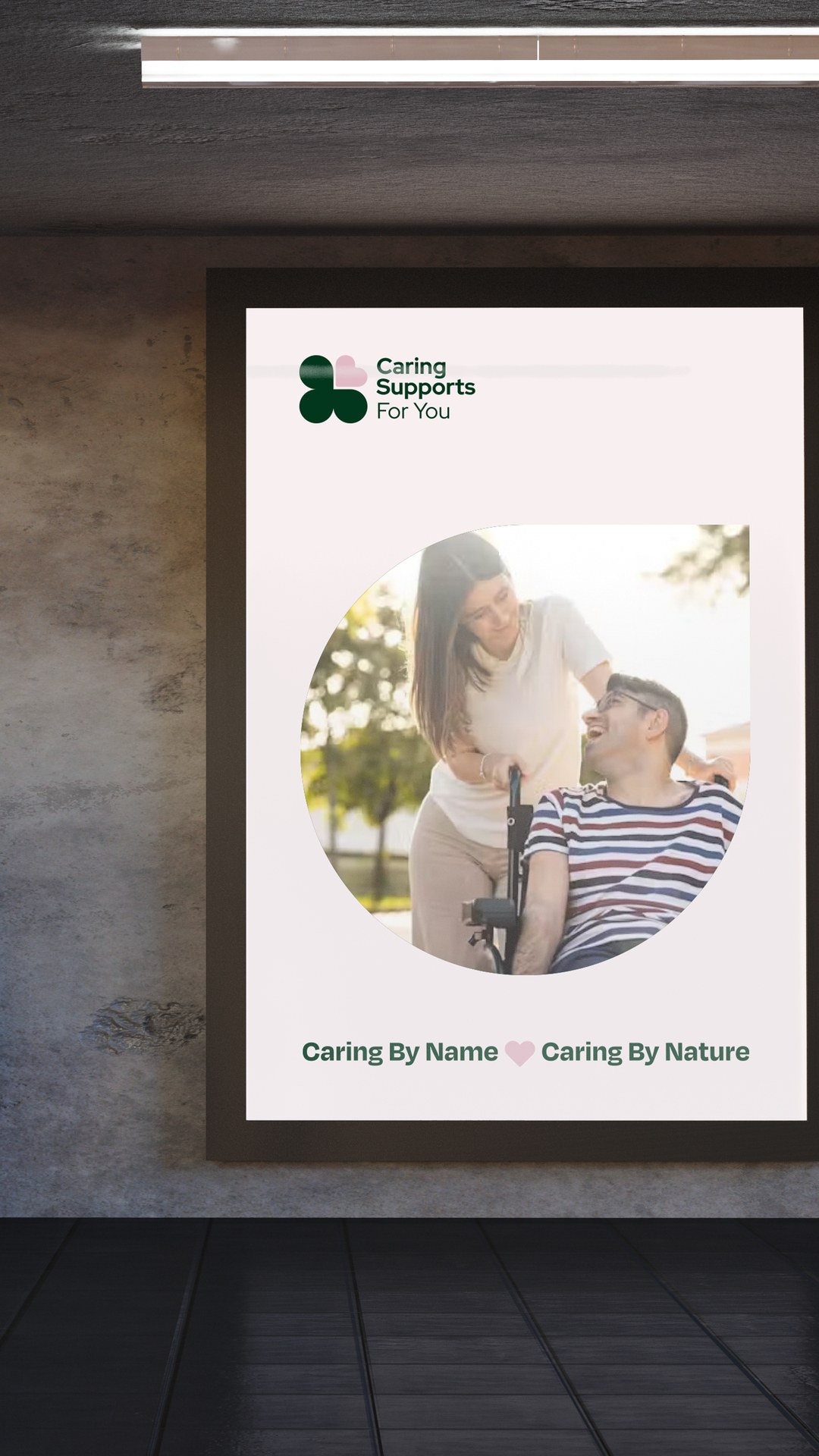
We built it around a clover of three green leaves and a pink heart, in dark green and soft pink. The sub-brands keep the clover intact and change only the heart, blue for Aged Living and purple for Kitchen. The guidelines cover the parent logo, the sub-brand versions, patterns, icons, buttons and voice, including the line “Caring By Name, Caring By Nature.” One rule is stated outright: no new sub-brand logos without approval.
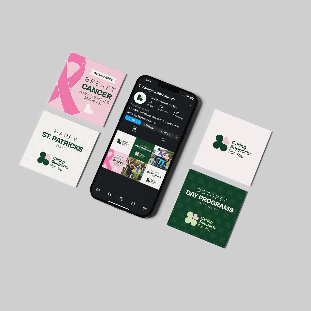
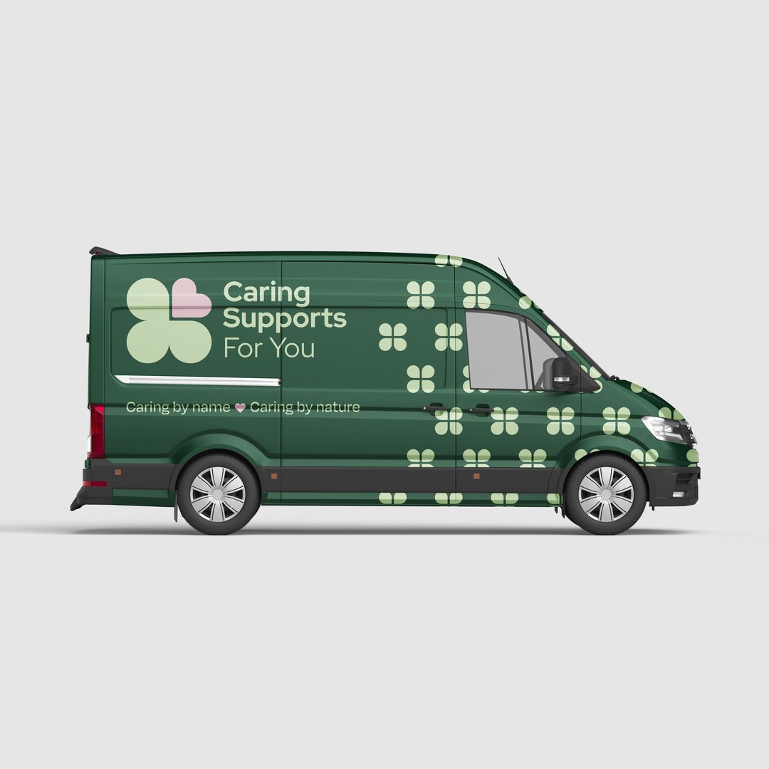
The identity then went onto a van wrap, a flag banner and merchandise. A set of social templates carries it online, covering awareness days such as Breast Cancer Awareness Month and St Patrick’s Day, and announcements like the October day programs.
Aged Living and Kitchen now read as part of Caring Supports For You, and the guidelines keep it that way.