A colourful identity, and a voice to match.
Chosen Family is an NDIS provider supporting people with disability and mental health needs, and it is built around community, inclusion, diversity and joy. That gives the brand two audiences with different questions.
A family looking for respite wants to know who will be in the room. A support worker reading a job ad wants to know what kind of place they are joining. The identity and the voice both had to answer, and had to sound like the same organisation doing it.
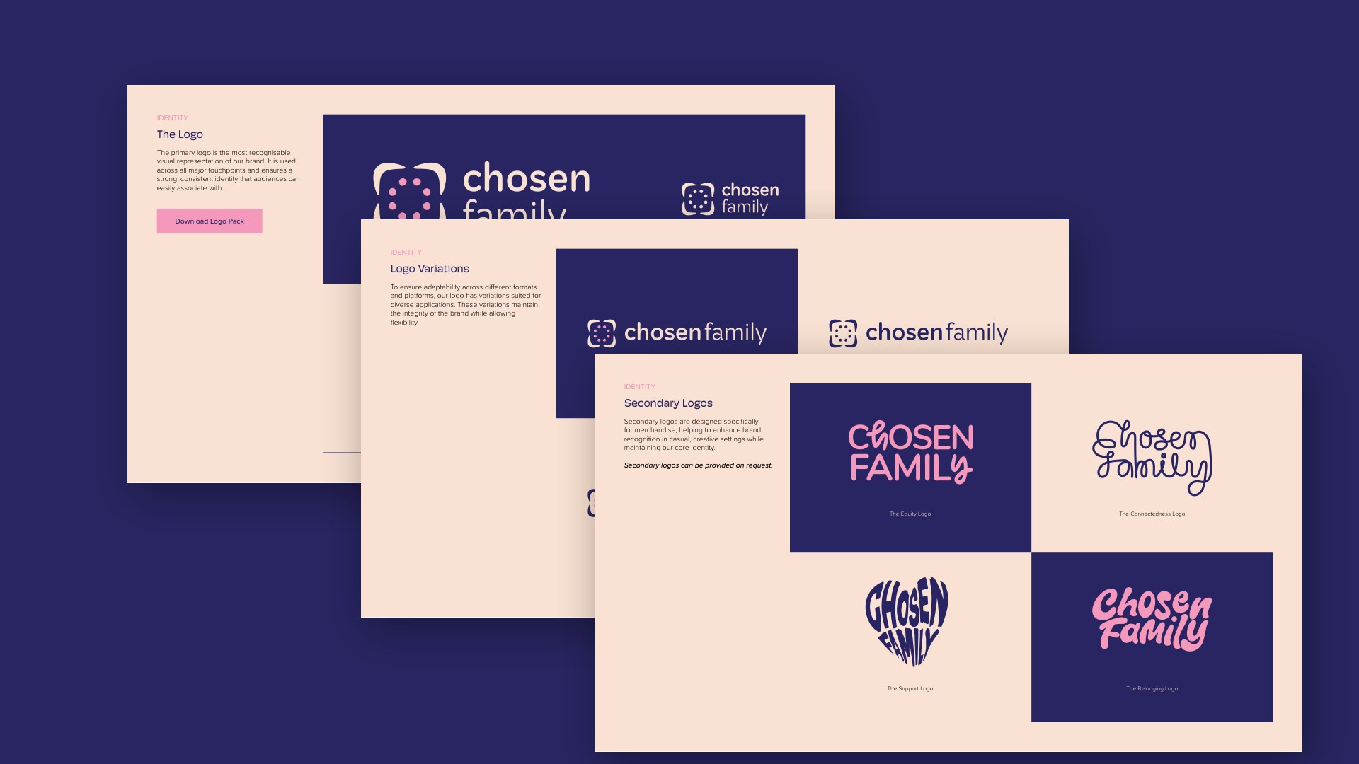
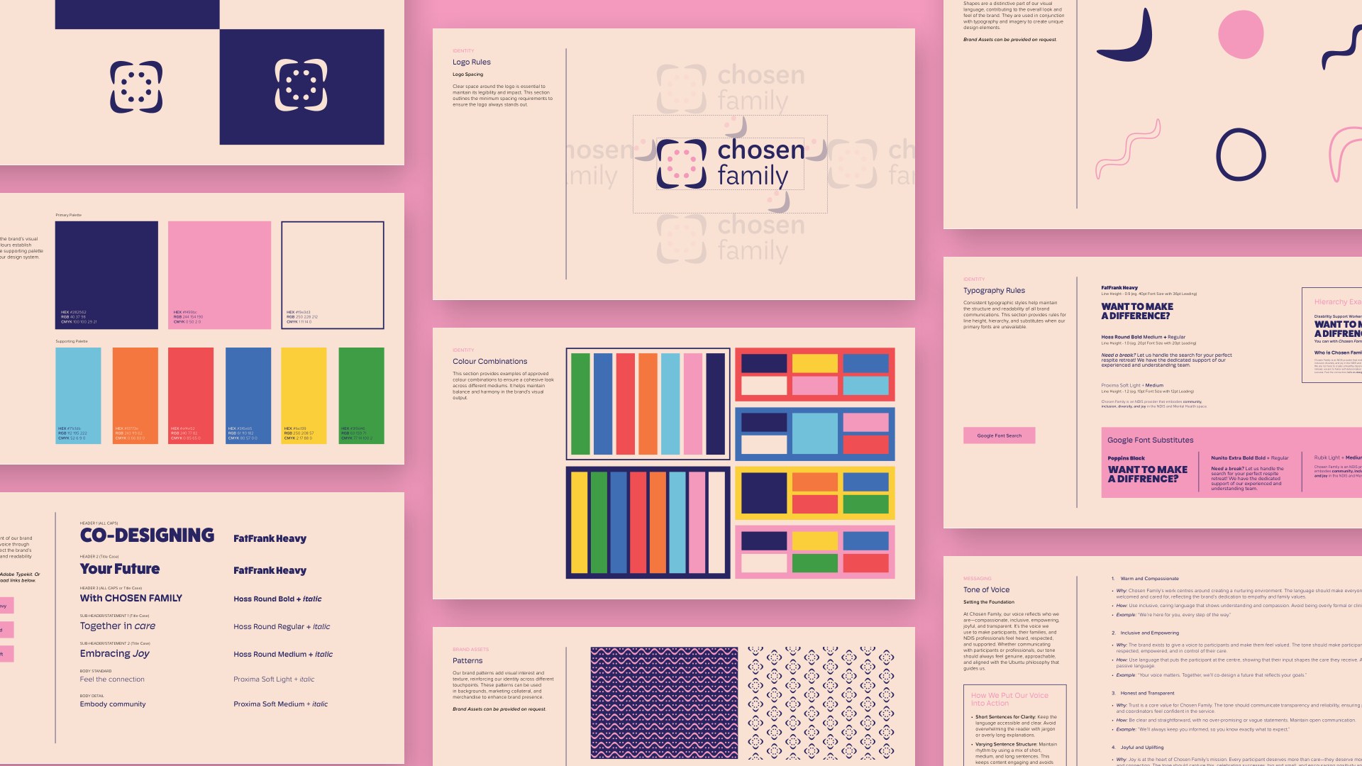
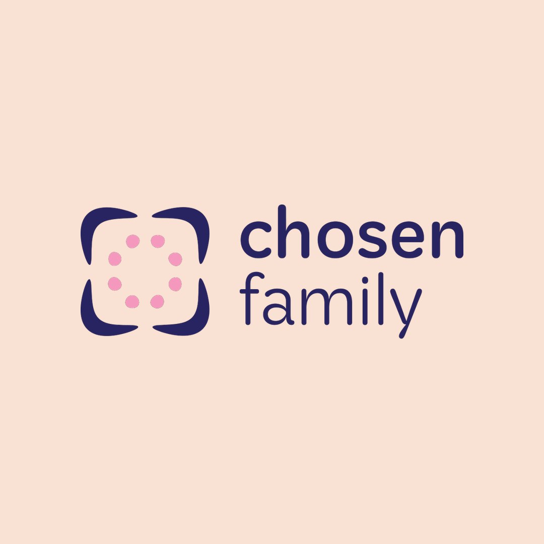
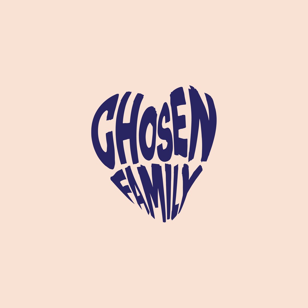
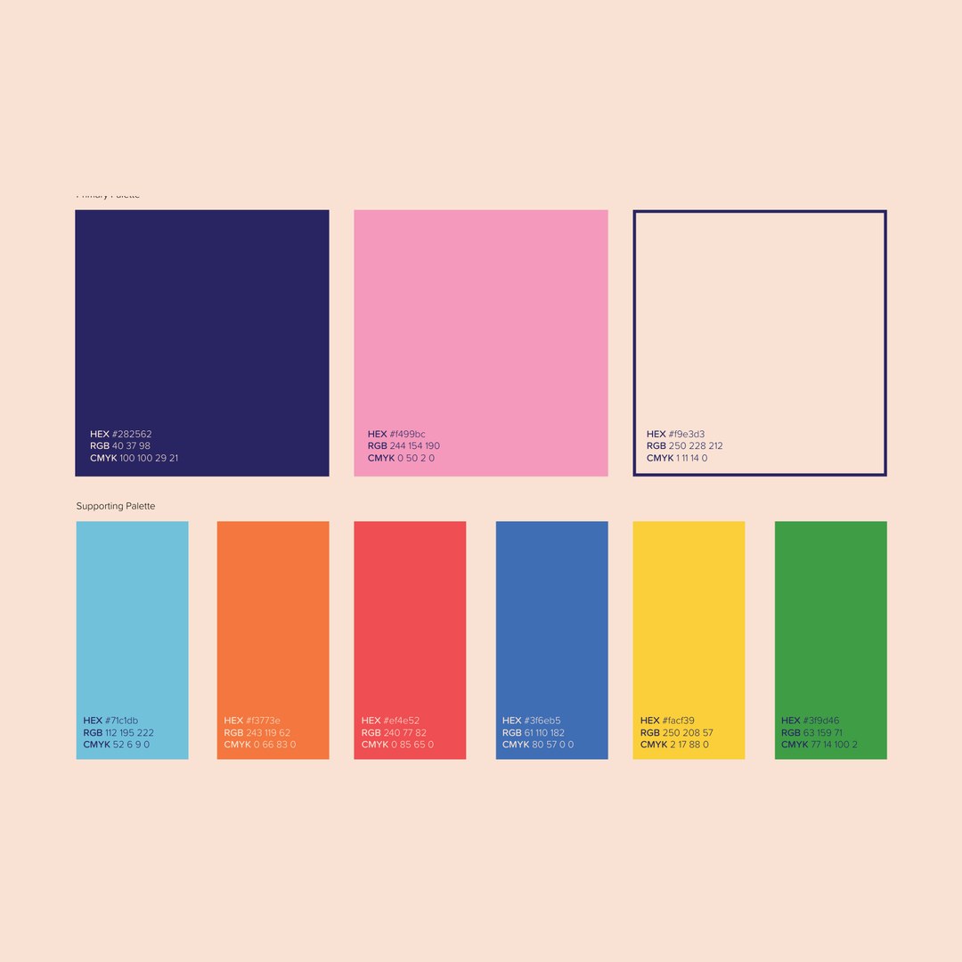
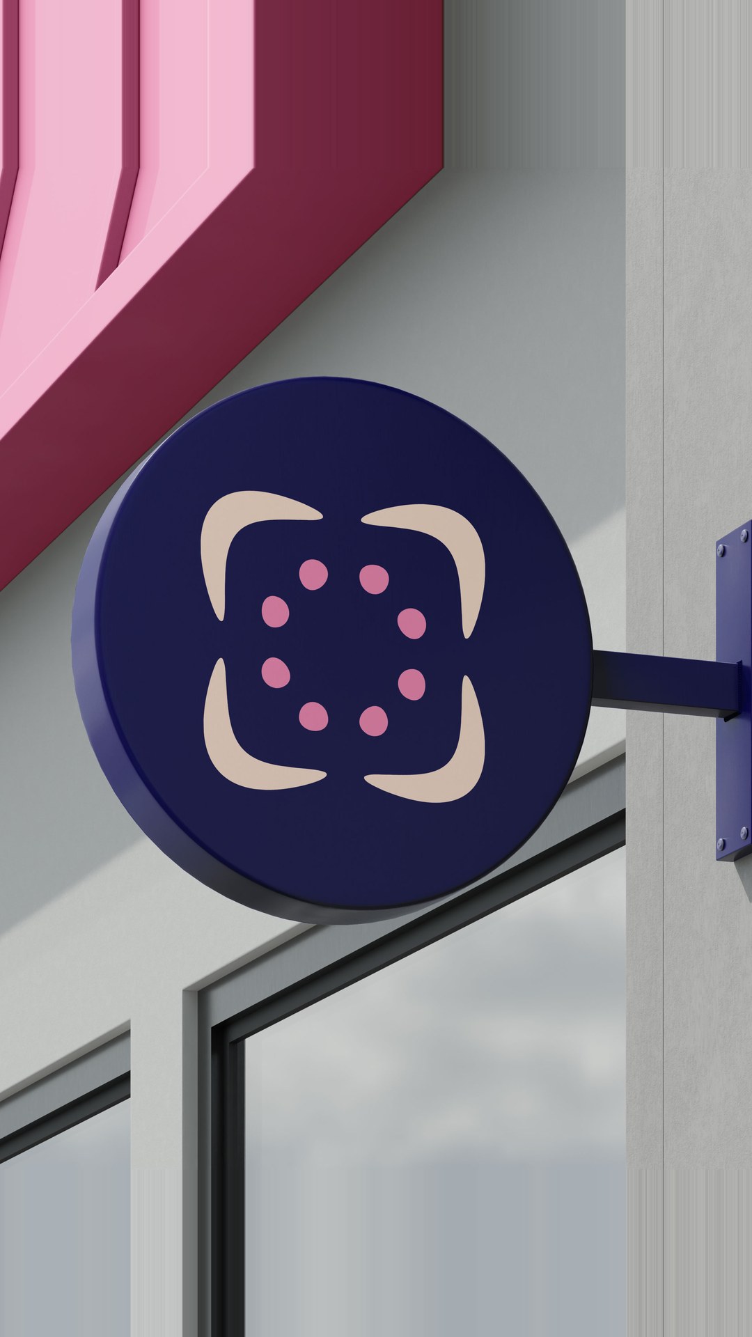
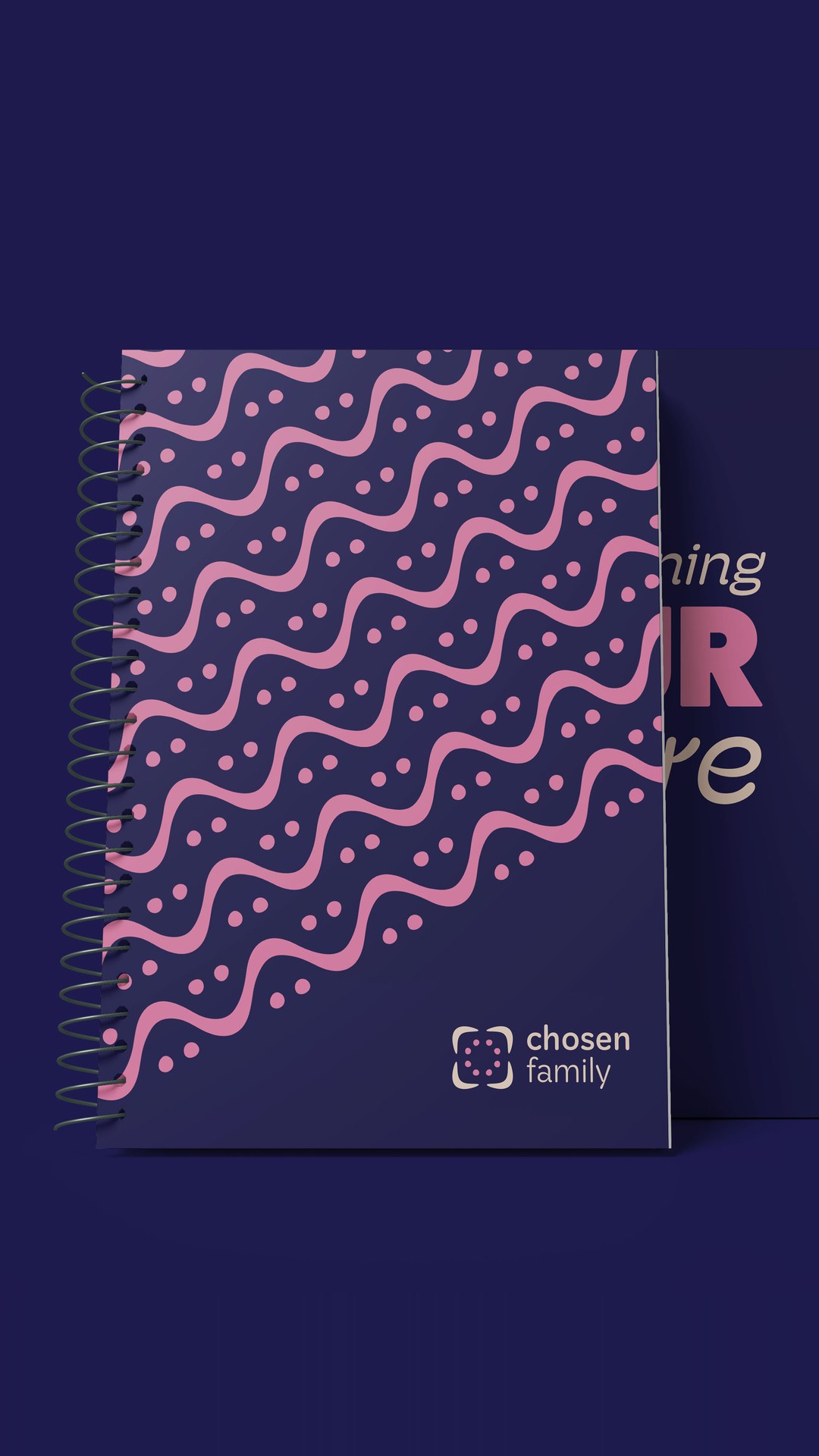
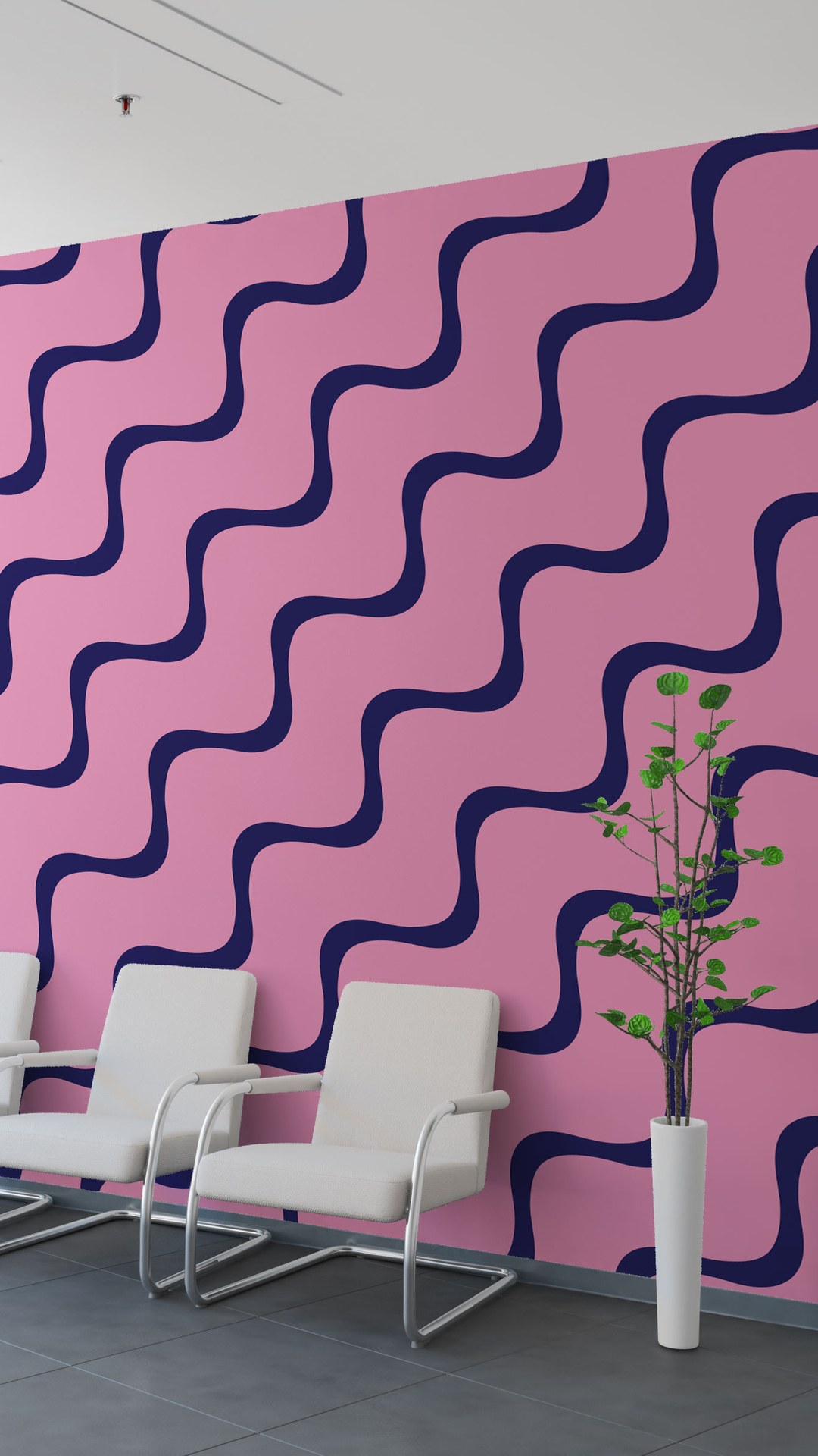
We built the identity around a rounded square holding a ring of dots, with hand-lettered wordmarks as secondary logos, one of them set in the shape of a heart. A navy, pink and cream palette sits above six brighter supporting colours, and wavy and dotted patterns carry the look across print and walls. The tone of voice is written down as four principles: warm and compassionate, inclusive and empowering, honest and transparent, and joyful and uplifting, each with a reason and an example.
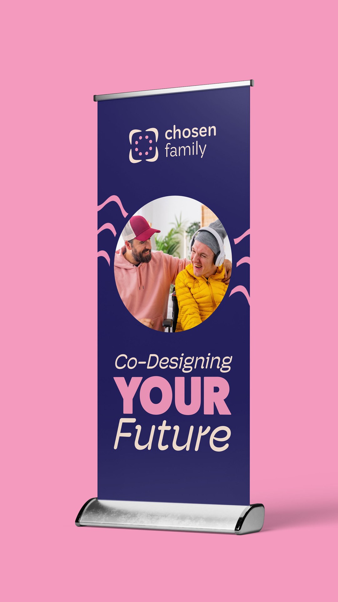
The system then went onto a pull-up banner reading “Co-Designing YOUR Future”, a blade sign, a notebook and a patterned feature wall.
Chosen Family now has one look and one voice for the people it supports and the people it hires.