A grassroots beer with a brand to match.
Drink West started as a grassroots Western Sydney lager, founded by two local UFC fighters. It had a beer and a lot of local pride, and it needed a brand that carried both onto a can.
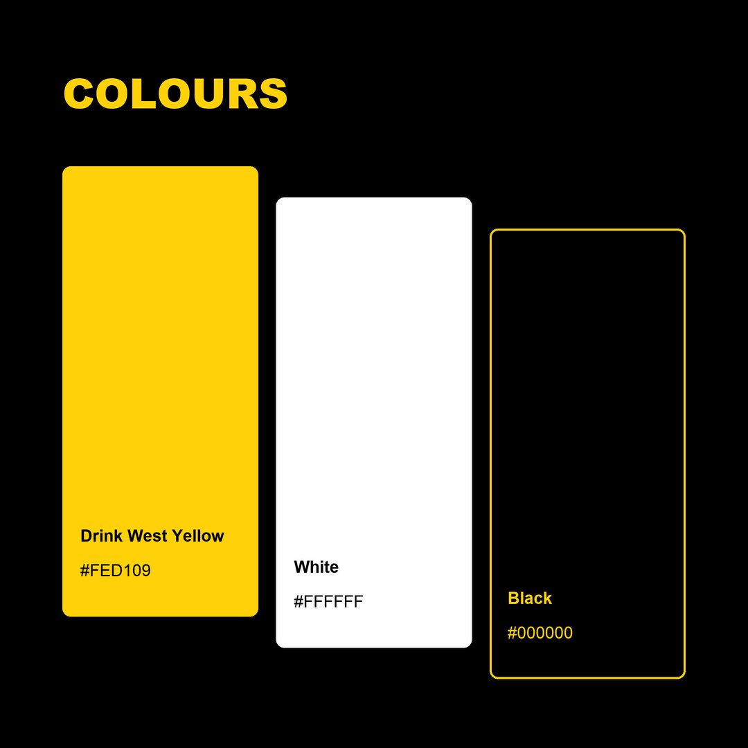
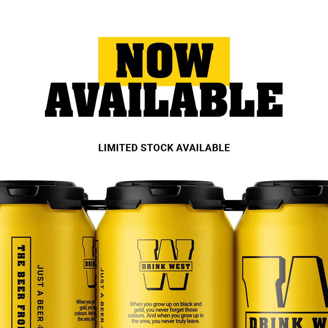
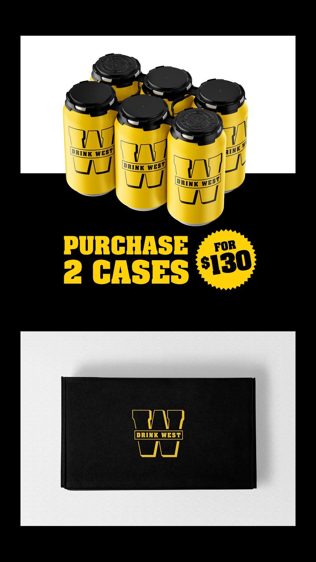
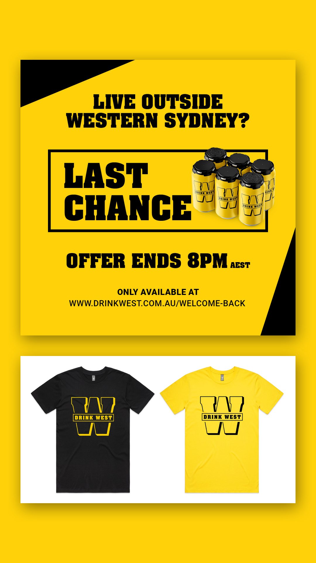
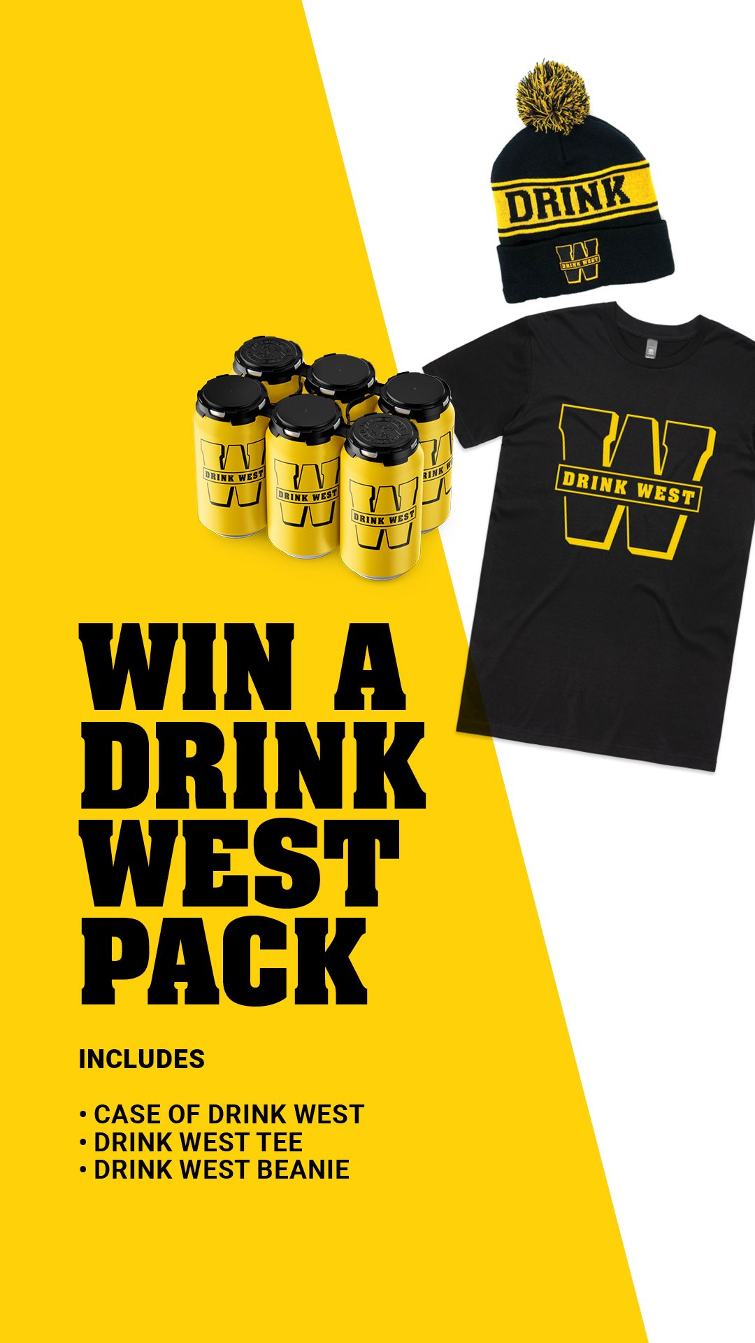
We built the identity around a heavy slab-serif W with the name boxed across it, in yellow and black. The colours are a nod to Black & Gold, the budget supermarket label that Western Sydney knows well, and the joke sits on the can itself: “When you grow up on black and gold, you never forget those colours.”
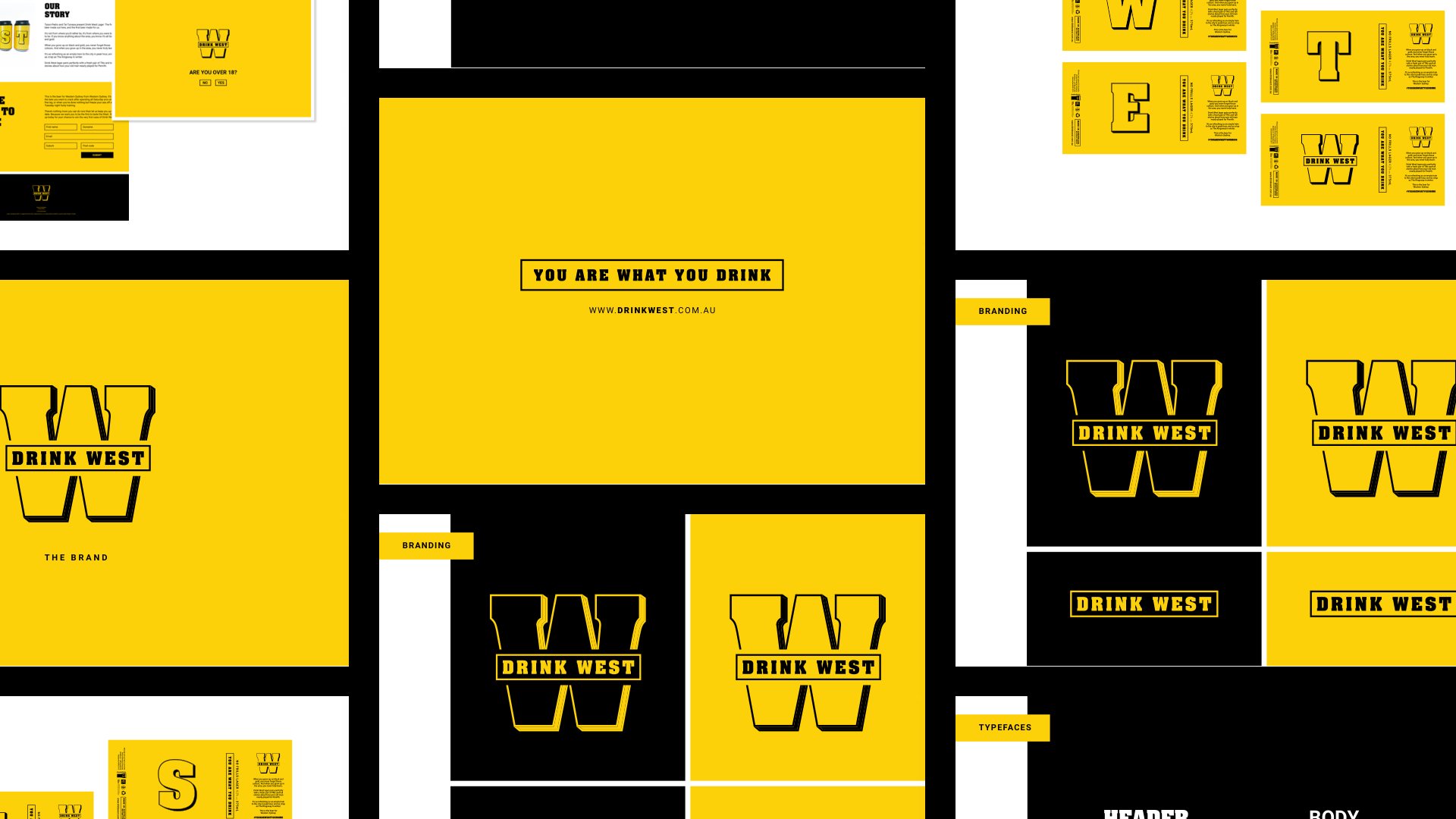
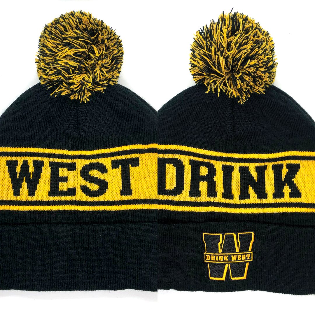
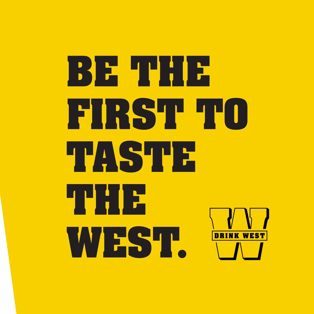
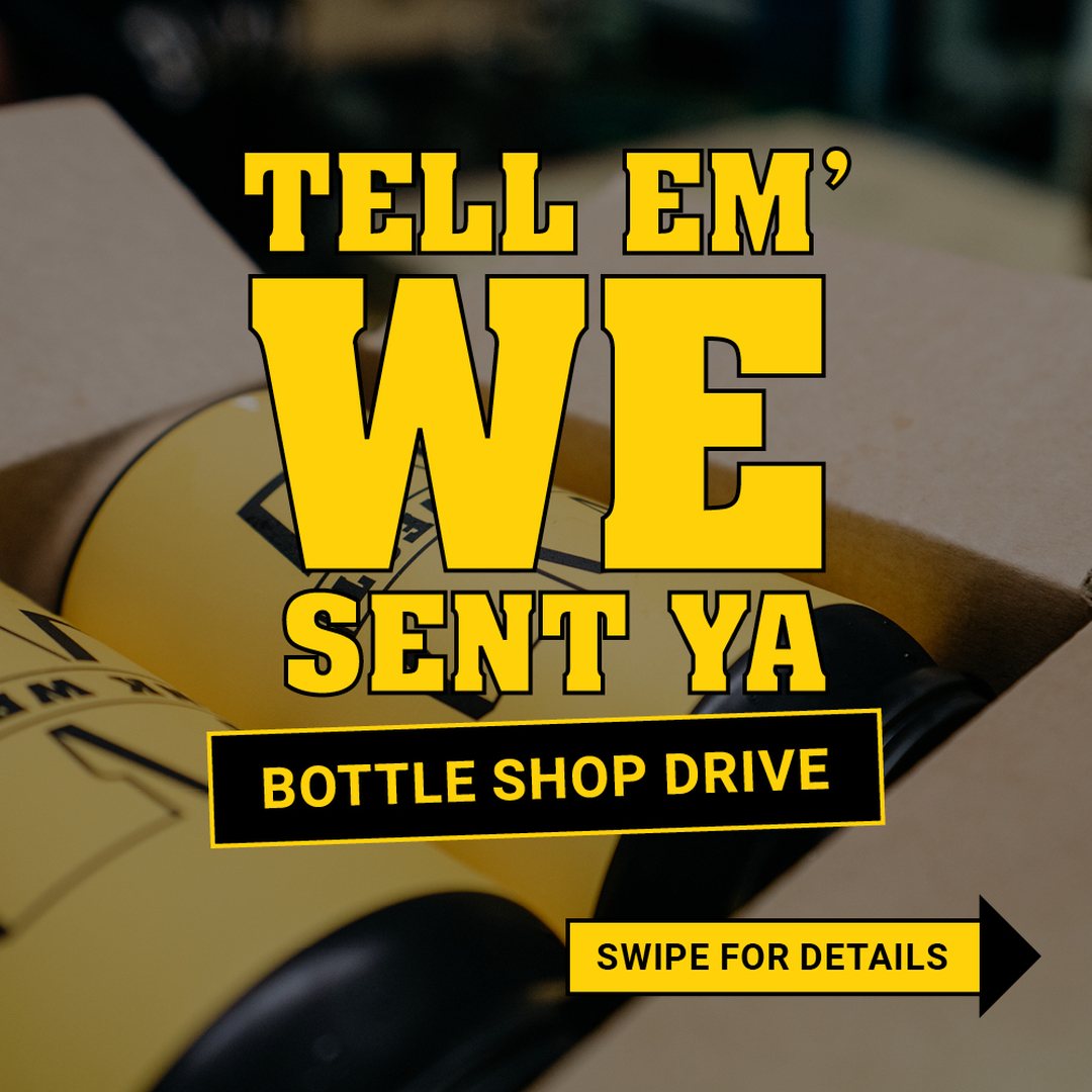
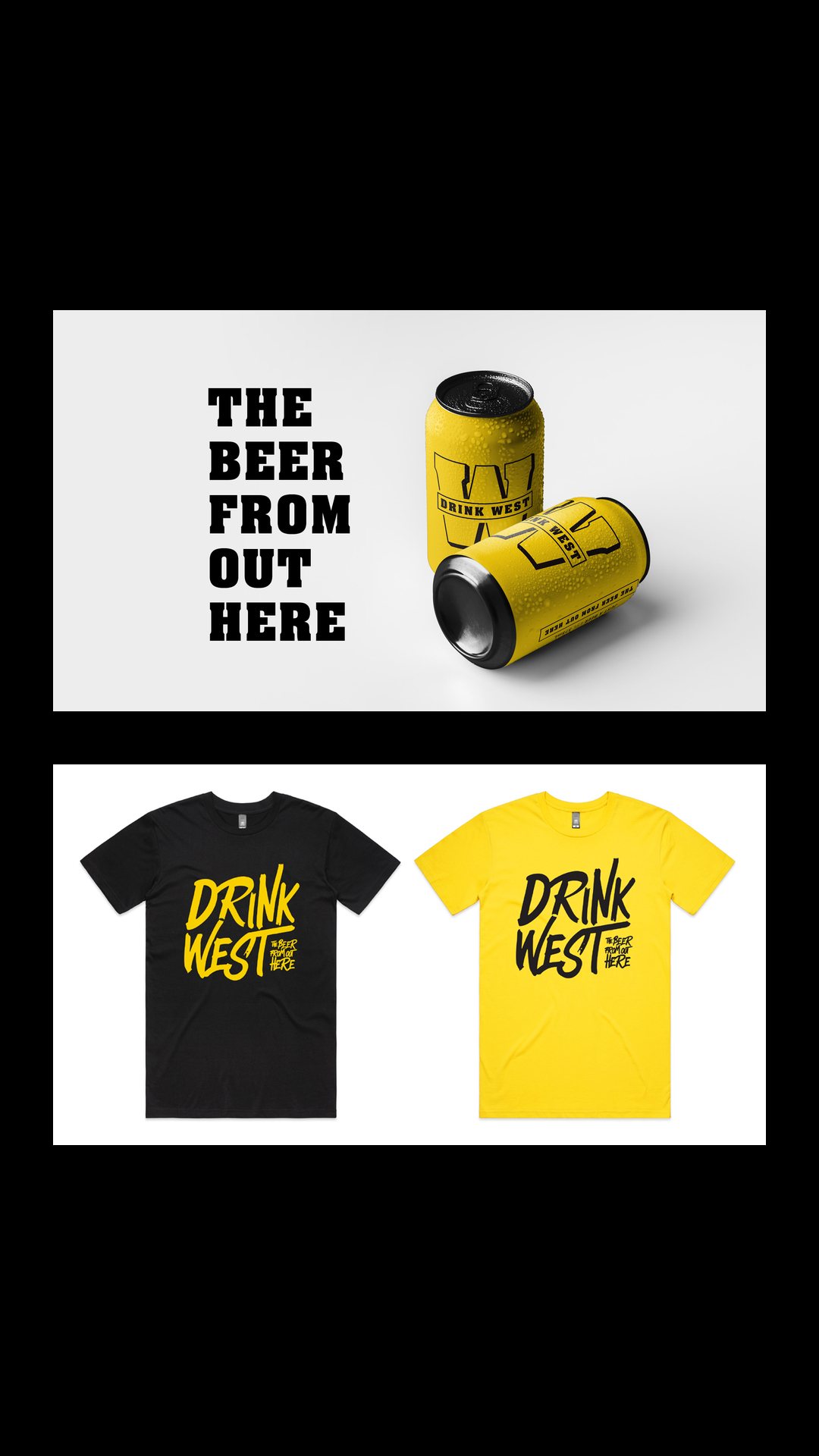
The tagline was “The beer from out here”, and the voice stayed short, loud and local wherever it appeared. It ran across the cans and the merchandise, from black and yellow beanies to tees, and into the posts that launched the beer. One read “Be the first to taste the West”, and another announced a bottle shop drive with the line “Tell ’em we sent ya”.
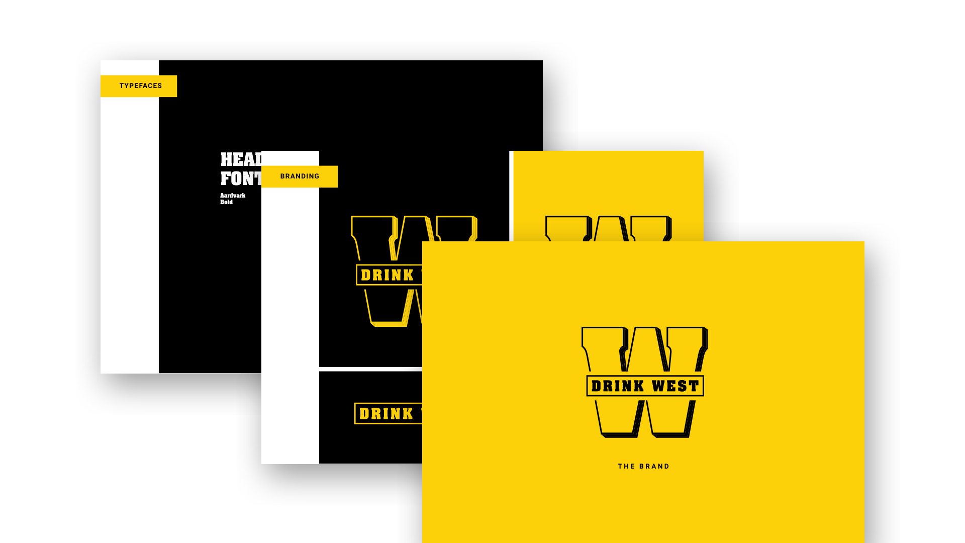
A brand guidelines document holds typography, colour and logo rules together, so each new piece looks like it came from the same crew.
Drink West went from a grassroots idea to a can and a range of merchandise that all look like one brand.