A town planning consultancy, with documents to match.
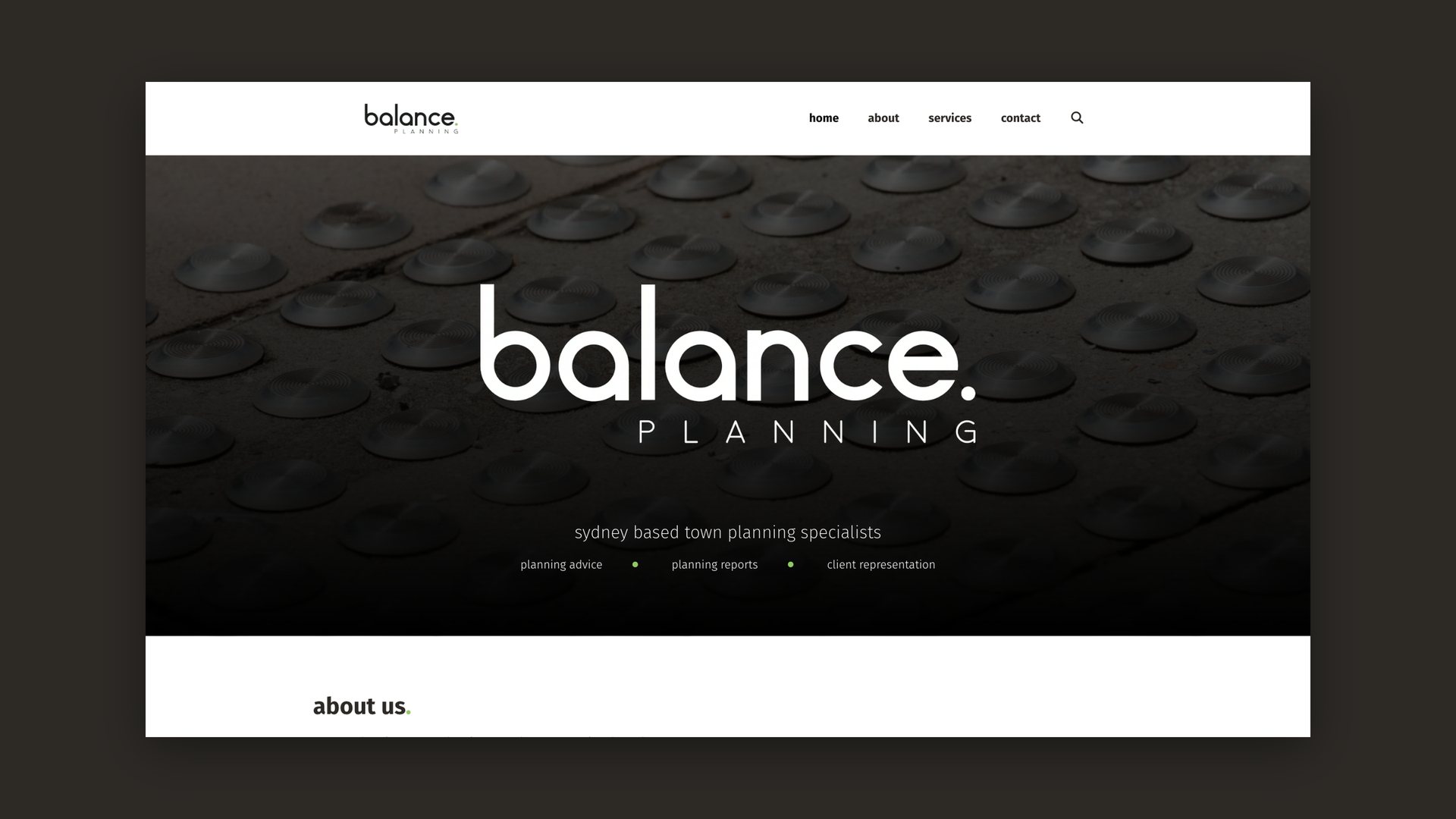
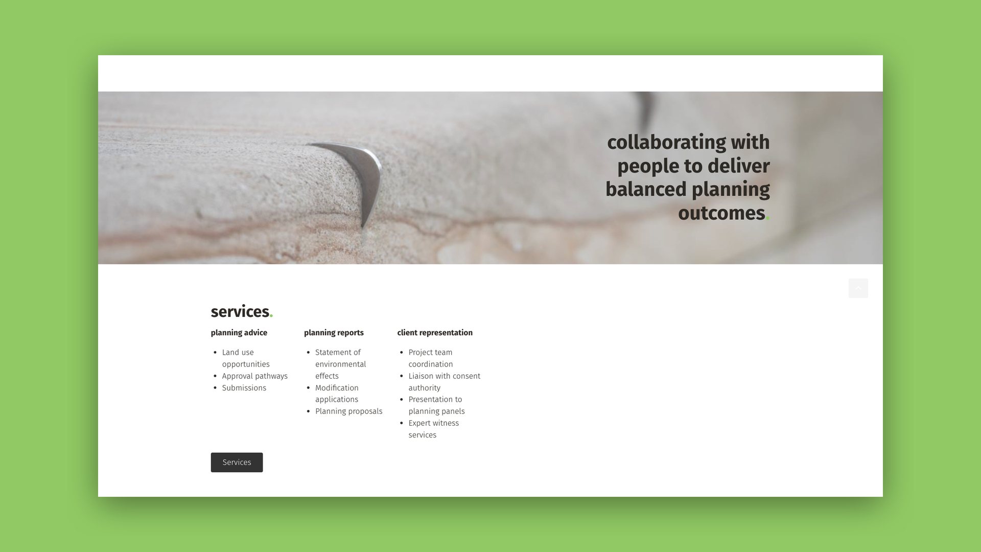
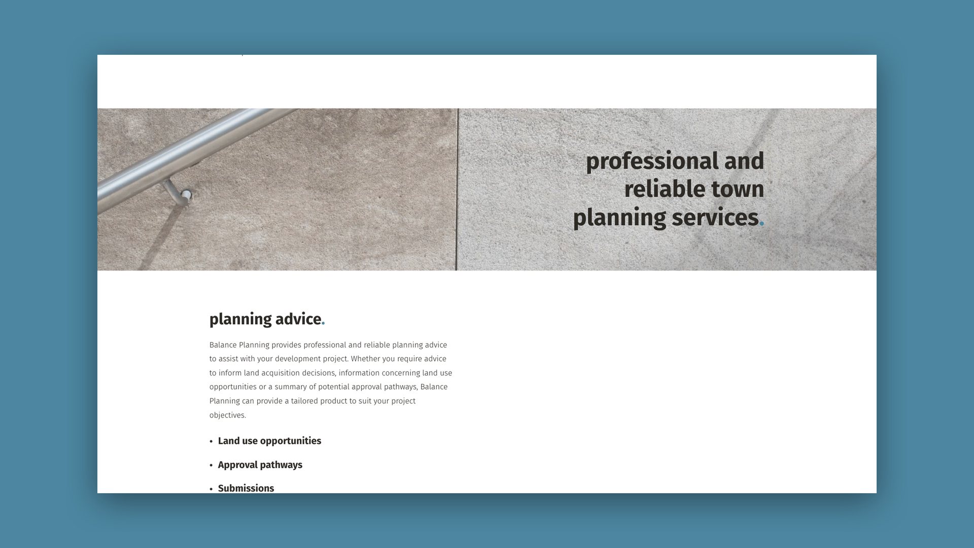
Balance Planning is a Sydney town planning consultancy offering planning advice, planning reports and client representation, with a mission to facilitate the delivery of balanced planning outcomes.
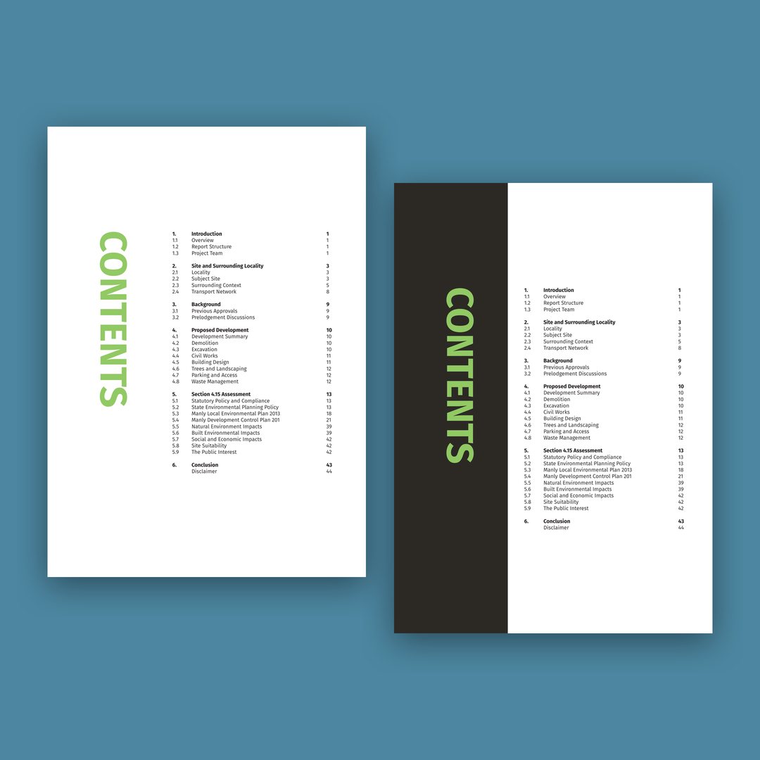
Town planning is judged on its documents. A statement of environmental effects or a planning proposal is what councils and clients actually read, so the look of the report is part of the firm’s credibility. Reports are long, with numbered sections and a contents page, so the brand had to work on a website and across dense pages, with a clear structure and consistent type that keep them legible and recognisably Balance.
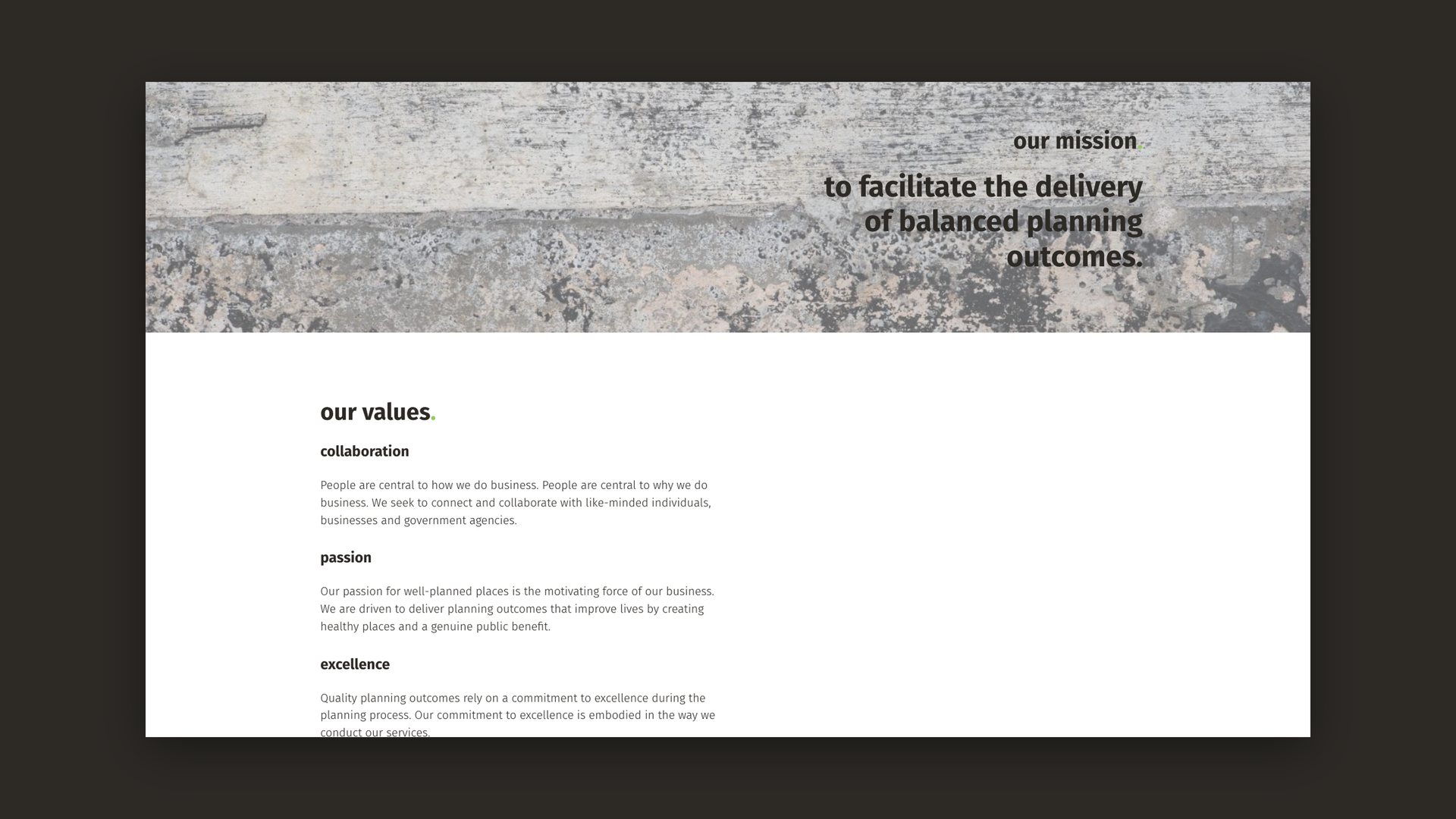
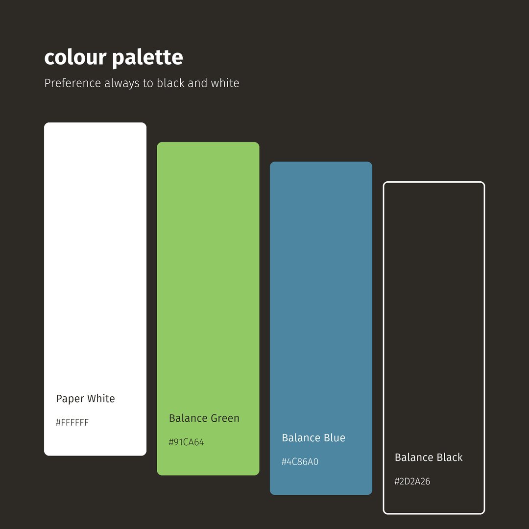
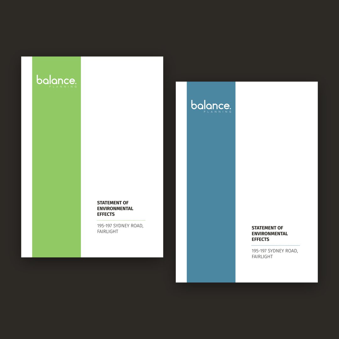
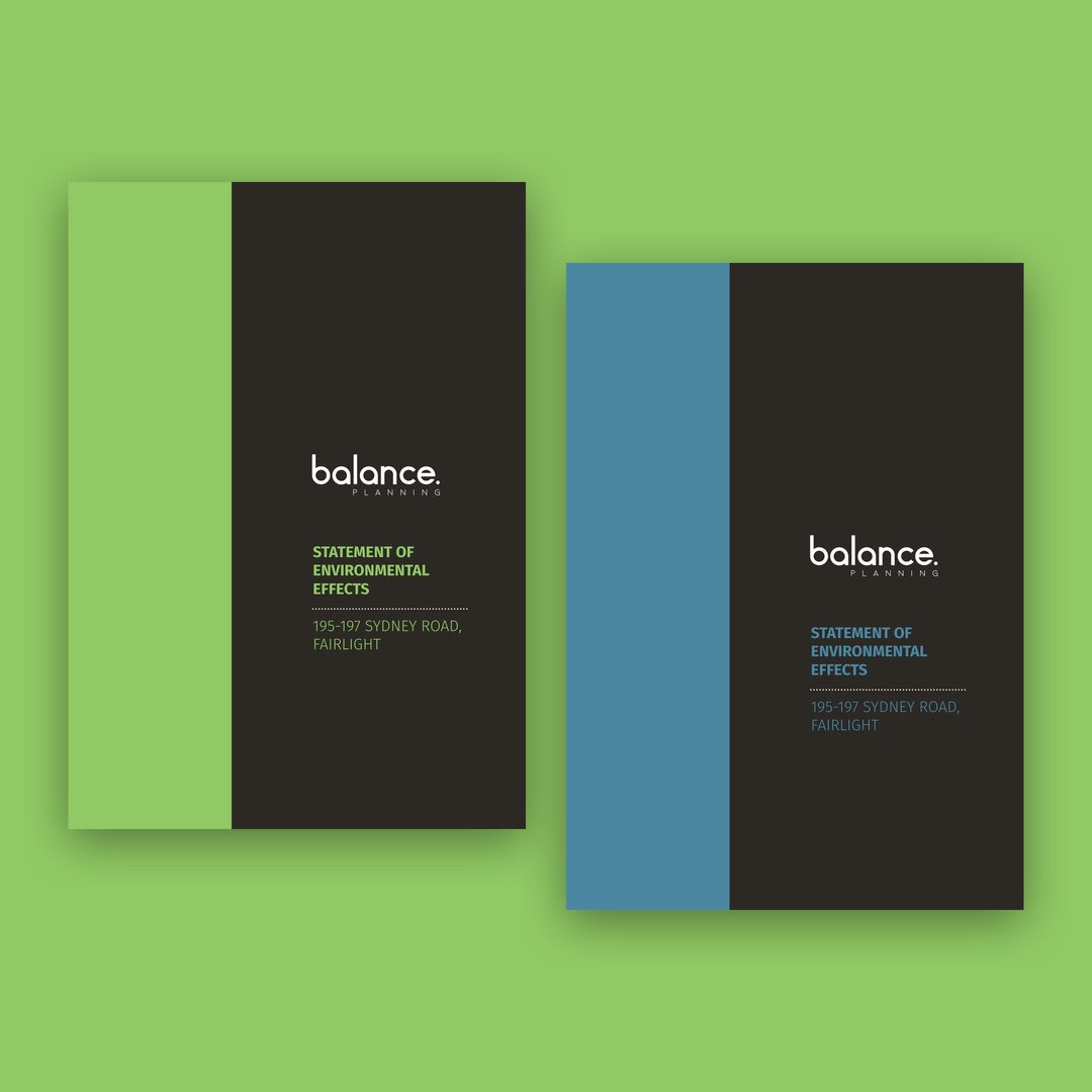
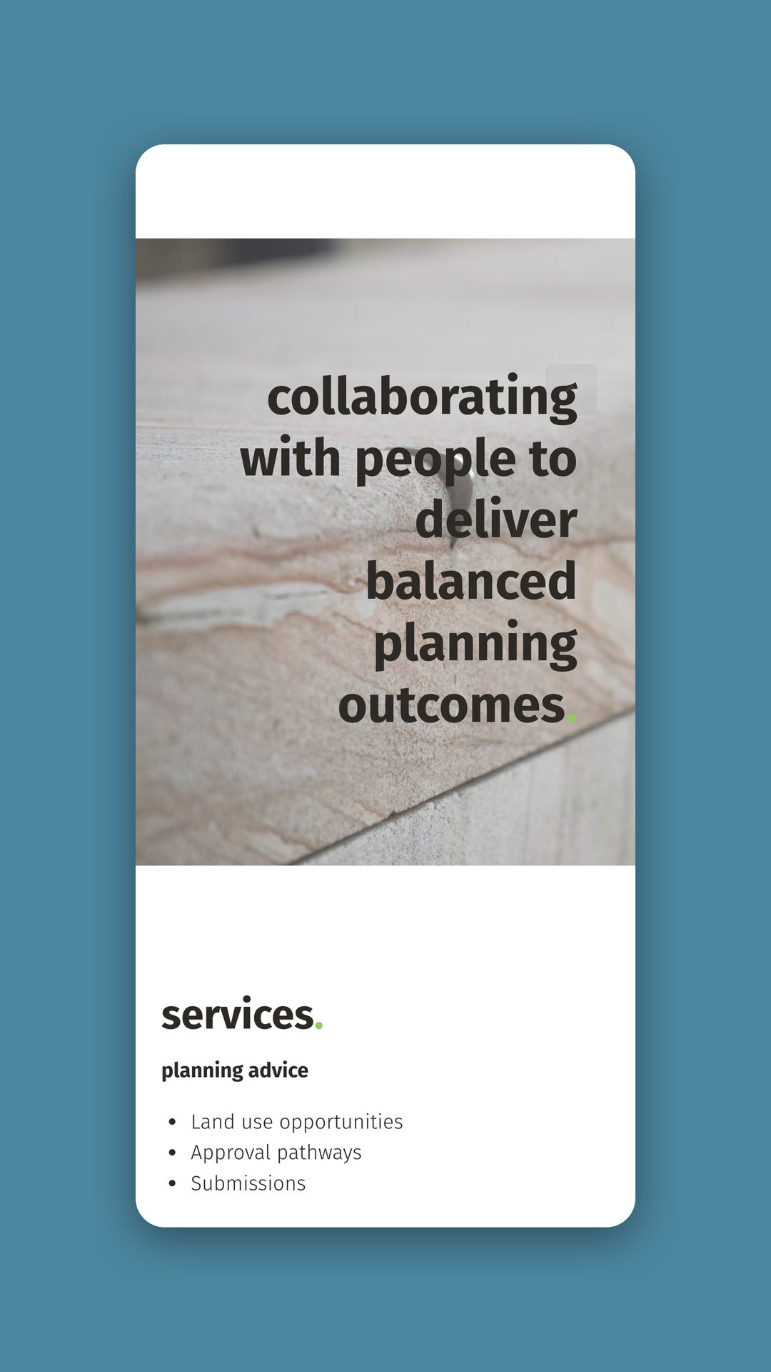
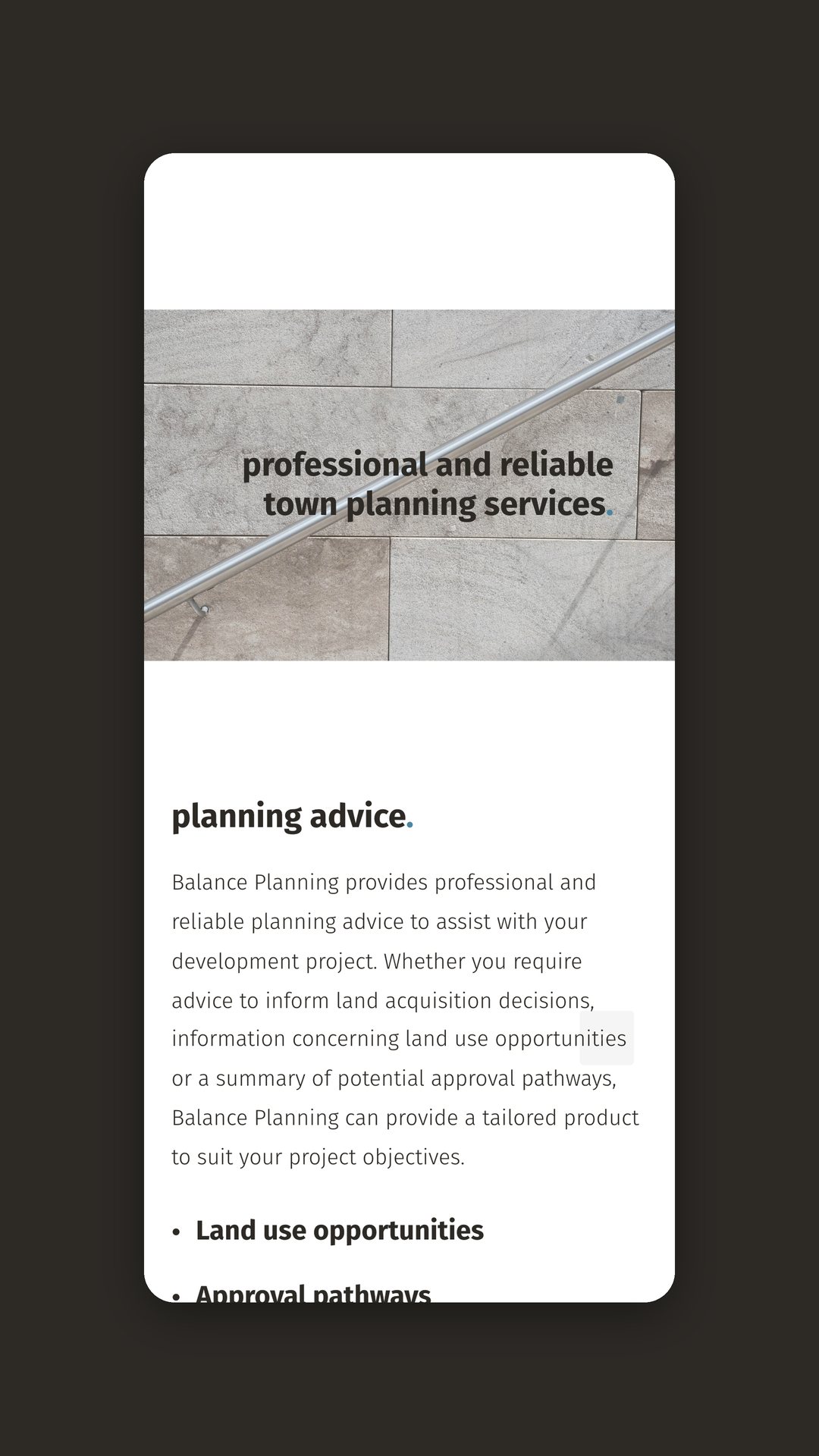
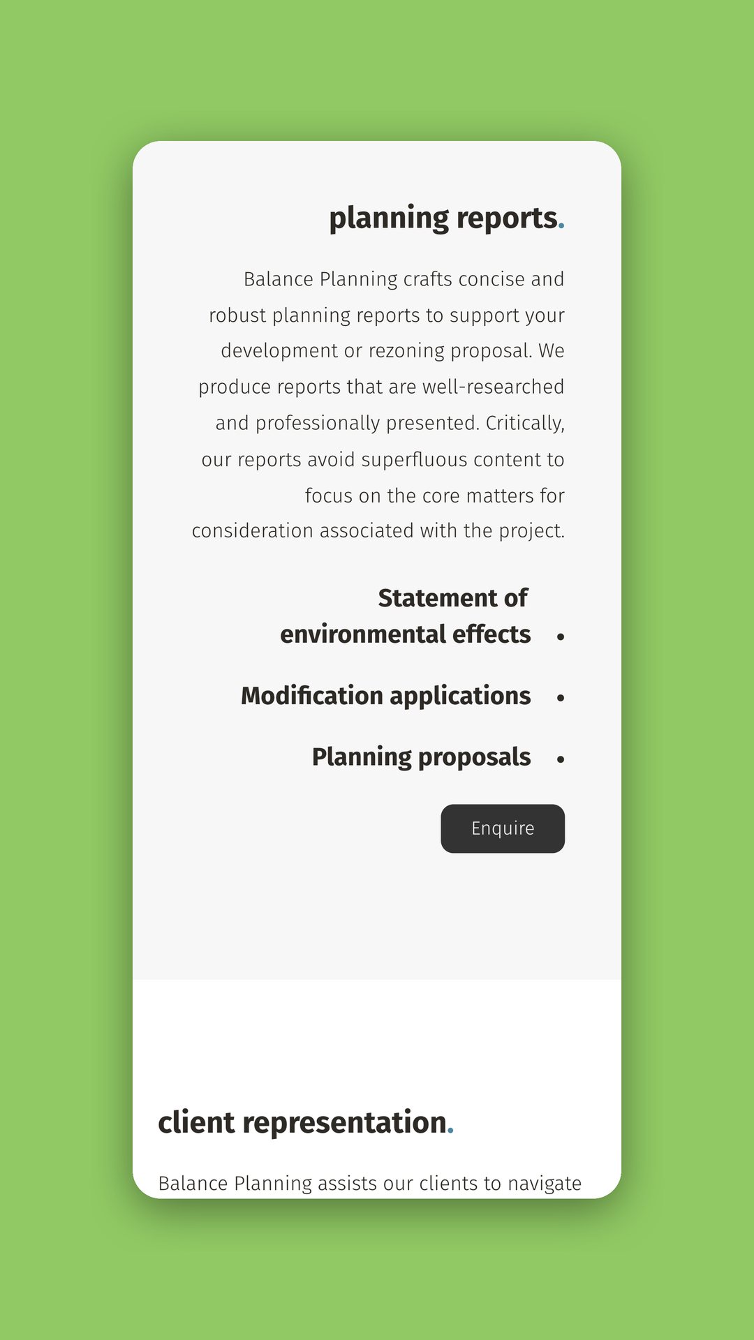
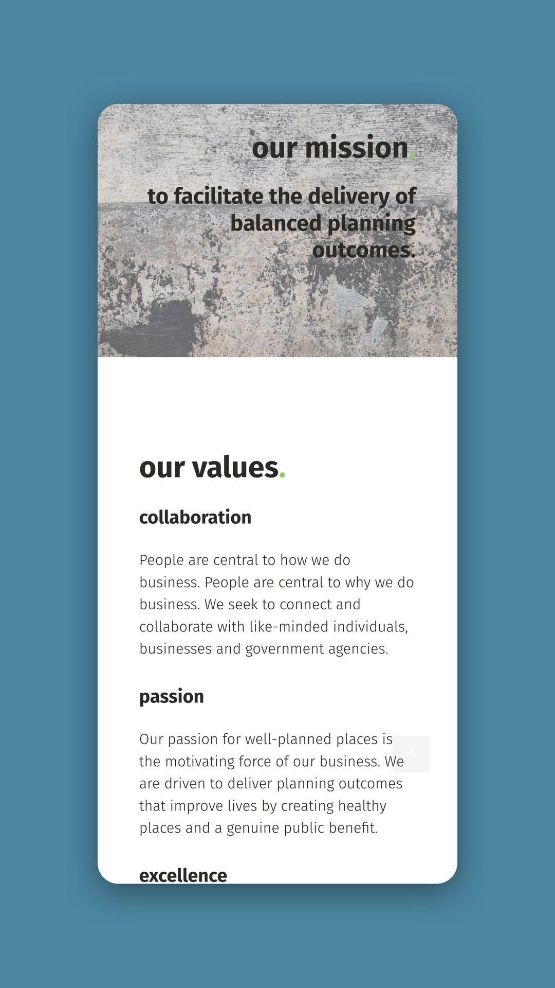
We built a lowercase wordmark and a “b.” monogram with a green dot, and a palette of Balance Green, Balance Blue and Balance Black, with a stated preference for black and white. Report templates in green and blue versions give every document a cover page and a contents page. The website carries the mission and the three values of collaboration, passion and excellence, sets out the services plainly, and has mobile layouts to match.
The same system runs from the website to the front page of a statement of environmental effects.
Balance Planning now looks the same on screen and on the cover of a planning report.