Everyday readiness, without the fear or the fringe.
Urban Resilience helps households get ready for outages and emergencies. Its brand guide describes the aim as positive resilience for normal people, without the fear or fringe of traditional prepping.
That is a narrow tone to hold. Readiness content can drift towards alarm on one side and survivalist kit on the other, and neither suits a household that simply wants to be prepared. The identity had to be calm enough to be read at the kitchen table.
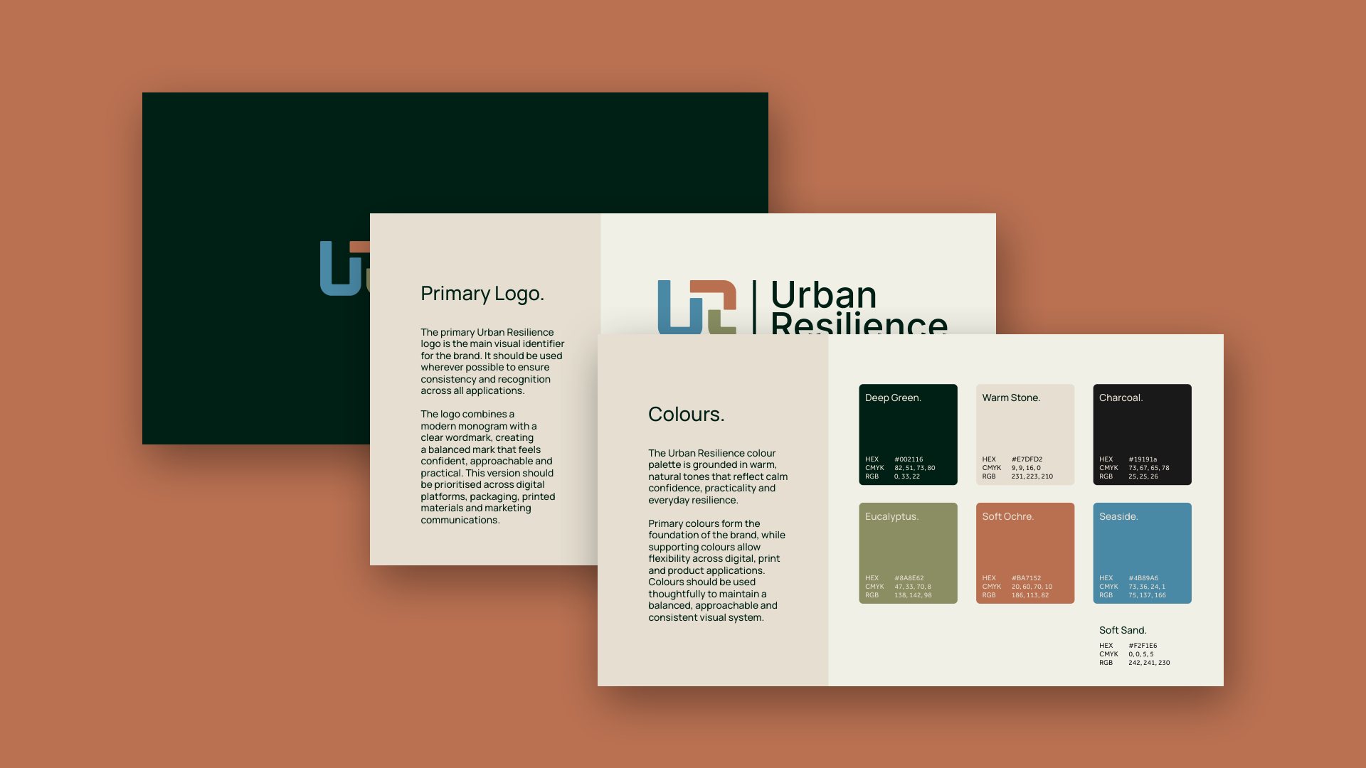
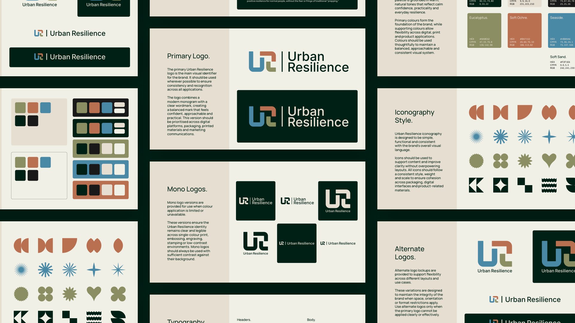
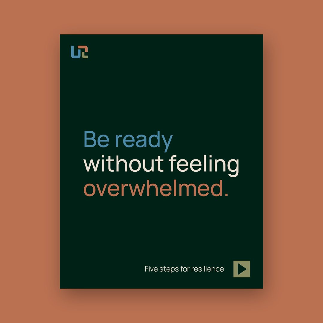
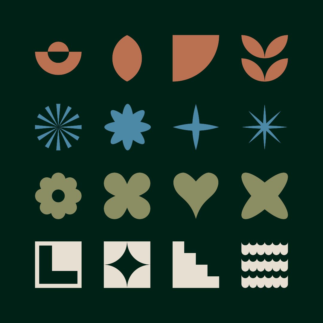
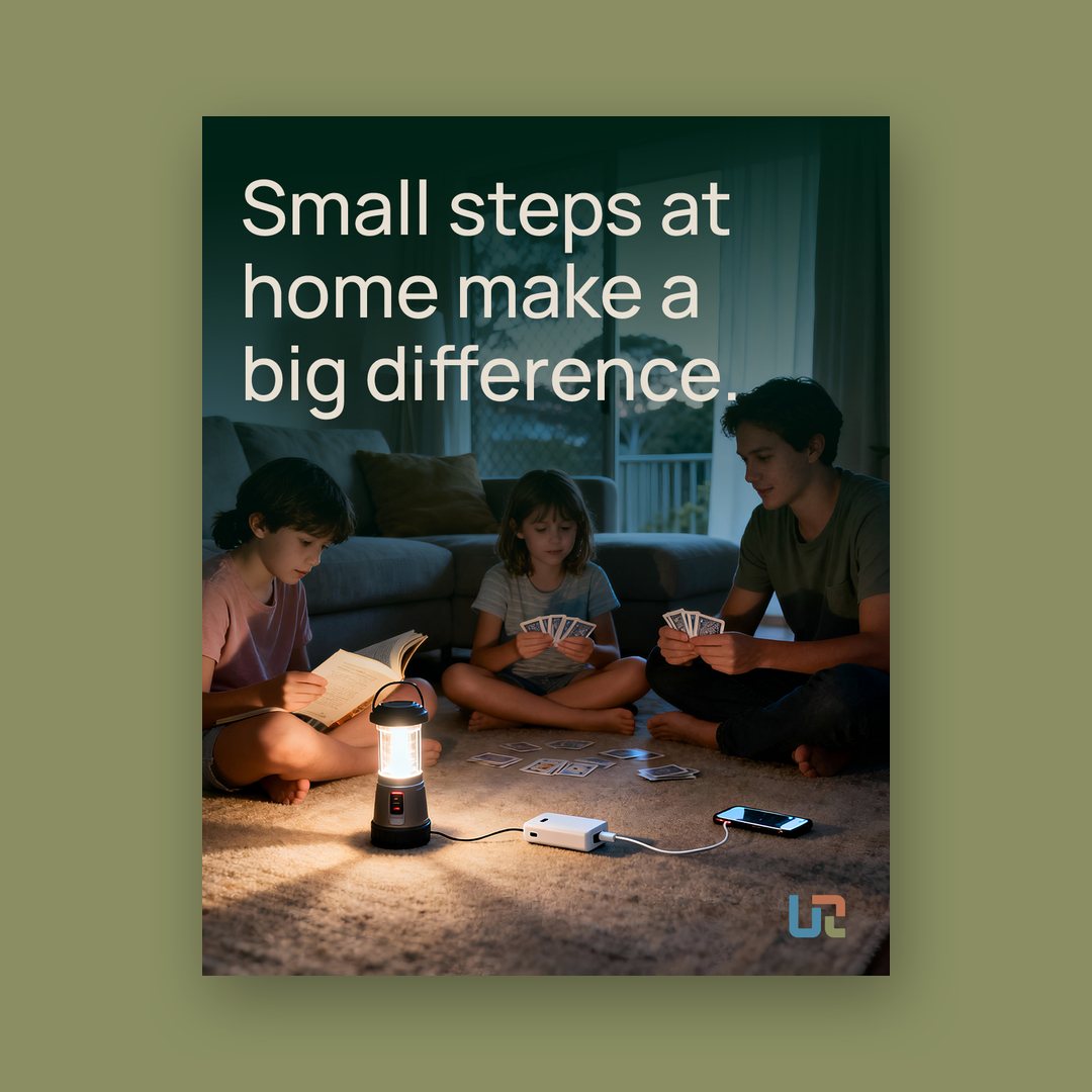
We built a UR monogram in blue, ochre and eucalyptus with a plain wordmark beside it, and a palette of deep green, warm stone and charcoal with three natural accents named Eucalyptus, Soft Ochre and Seaside. The guide adds mono and alternate logos, a set of simple geometric icons and a calm, plain voice. The campaign lines follow it: “Be ready without feeling overwhelmed.” and “Small steps at home make a big difference.”, with a “Five steps for resilience” series behind them.
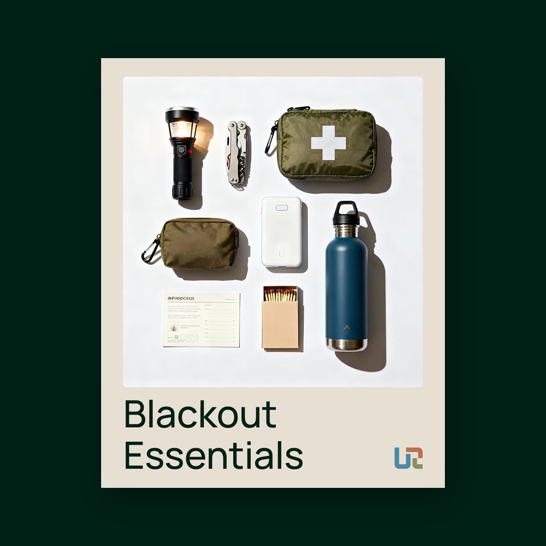
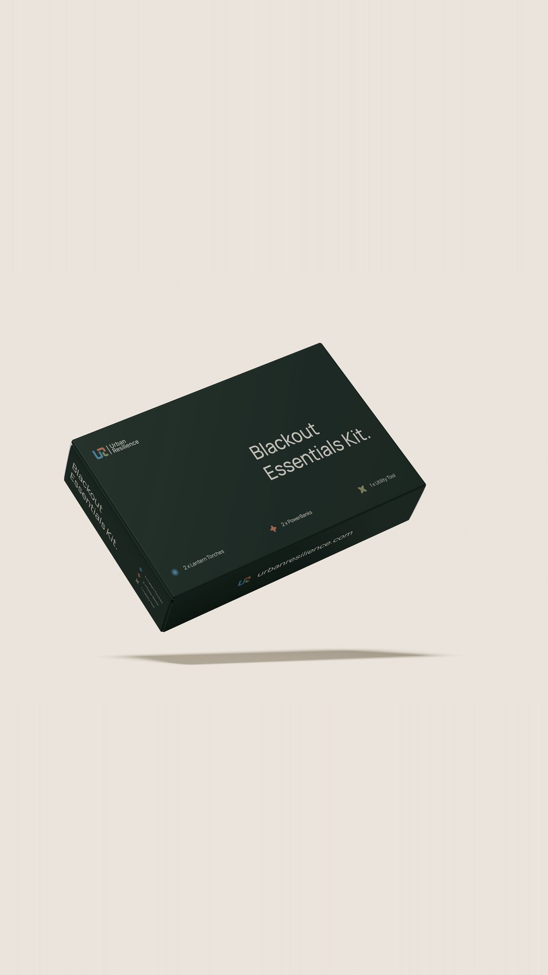
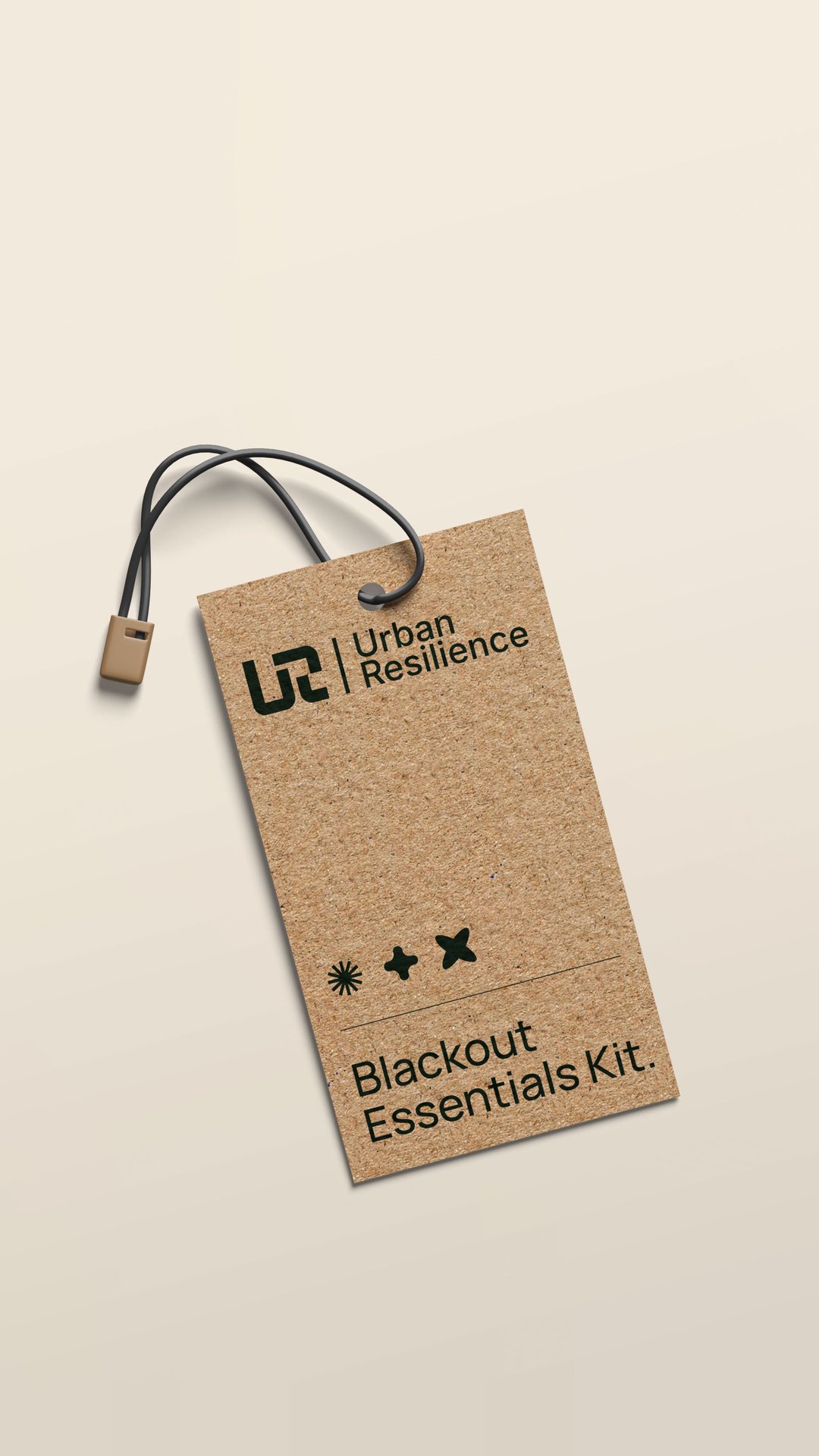
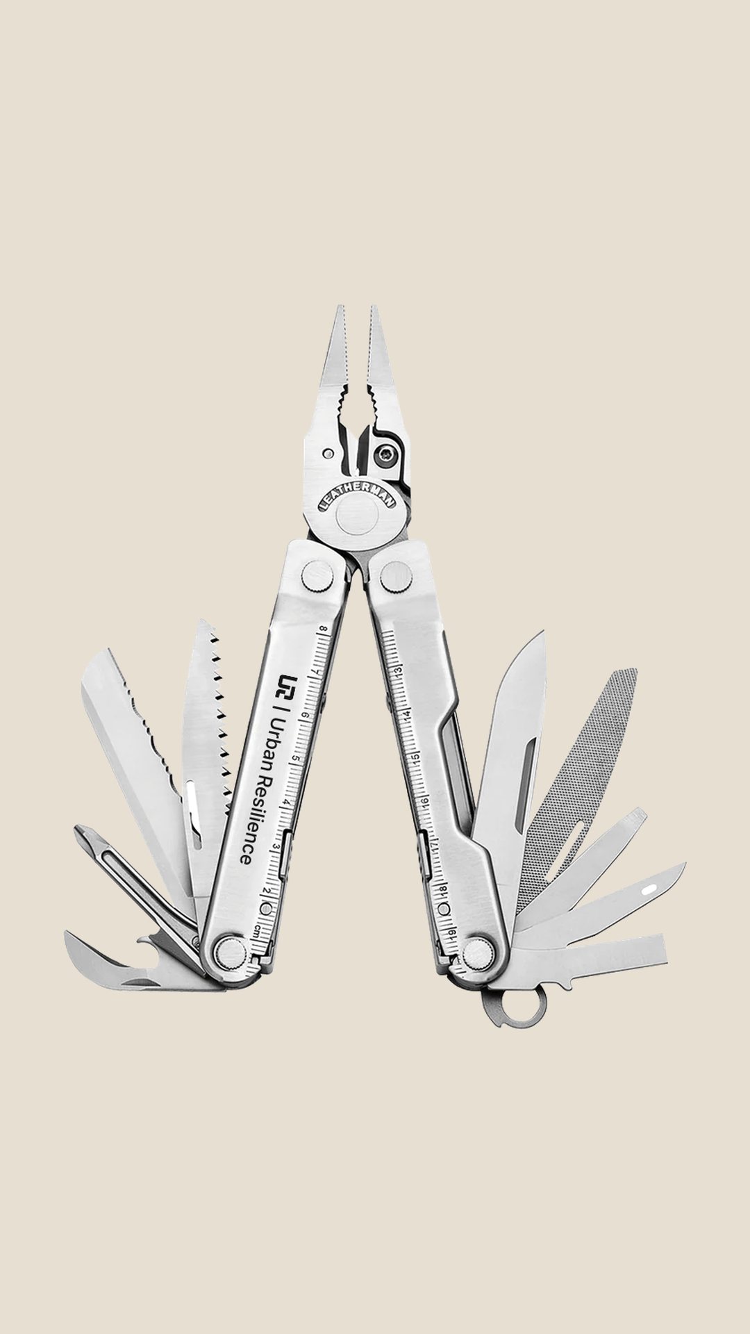
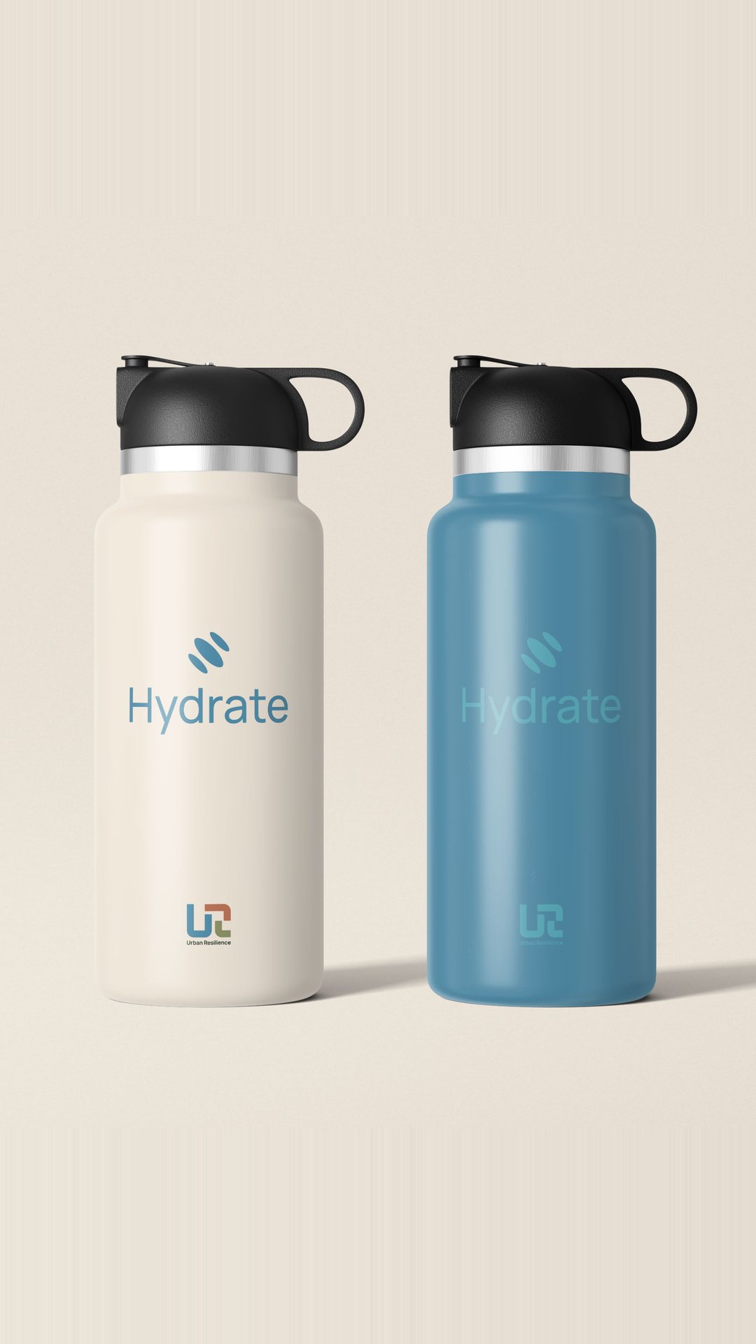
The first product is the Blackout Essentials Kit, with a box, a swing tag and a flat-lay of its contents: a torch, first aid pouch, power bank, water bottle and multitool. Branded water bottles carry the same mark.
Urban Resilience now has a calm, practical brand that makes being ready feel like an ordinary household job.